In 2012, Mike and I started Sellbrite (originally called Seller AppVantage) to solve the pain points of multichannel selling that we were experiencing ourselves. Our goal was to help other online retailers grow by making it easy to expand and sell on other marketplaces. We built Sellbrite to be the hub among all the channels and make it easy to pass data from one to another. That was represented through our original logo: 8 multi-colored spokes pointing to a central hub.
Since then, our company has continued to grow and evolve. We quickly realized that simply connecting channels was not enough. If we were going to help our customers grow, we needed to provide the intelligence necessary to be successful. That’s been our focus these days, and we’ve made some significant advancements in both our technology and our company.
Not only does the Sellbrite platform do things in a smarter, more efficient way, but within the application we’ve added powerful reporting functionality so our customers have a cross-channel view into their business. We also built a Customer Success team to help new customers get setup for success and existing customers with ongoing improvements and optimization. And that’s just the beginning. We have big plans for some truly game-changing innovation.
With all of this growth and change, we felt that it was important to have a brand identity that represented who we are and what we do. We weren’t just a hub-and-spoke technology solution anymore. We evolved into a company and culture with a pulse that not only helps expand your reach, but also provides the intelligence and flexibility to drive your growth.
So today I’m excited to unveil our updated brand identity and our new logo!

Why an Octopus?
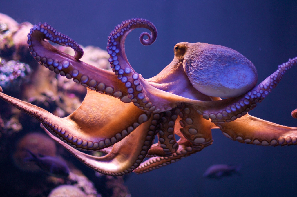 An octopus represents intelligence, flexibility and reach – the three key elements that are the focus of Sellbrite.
Octopuses are known for their intelligence, and are able to adapt to the conditions they are in. They are multifaceted and skilled in many areas. They are extremely flexible, and of course, with 8 arms, an octopus has a multi-touchpoint reach that is second to none.
We wanted a logo that was more than just an inert, lifeless symbol. We wanted it to feel alive, be in motion, and have heart (an octopus has 3 hearts!).
When we looked at all these factors, an octopus felt like an obvious choice (plus they are just awesome animals – check out this video).
But of course, an identity is more than just a symbol. So we’ve begun redesigning the entire Sellbrite experience to better reflect the intelligence, flexibility and reach – and value that we add to our customers everyday – that have become so important to us. You’ll notice our new color scheme, fonts, and of course, our octopus logo on our new website, in the application and in all our other touchpoints.
We’re proud of how far we’ve come and grateful for all our customers that have trusted us with their businesses. Stay tuned for more new and exciting announcements from us as Sellbrite continues to grow.
-Brian