
UX, a horrible little acronym – that isn’t actually an acronym. Designers and developers often talk about it in reference to architecture and aesthetic principles, often without any mention of the economic impact. I’ve always shied away from it myself out of… well… ignorance. That was until a couple of months ago, when I logged into one of my newest web stores to find this:
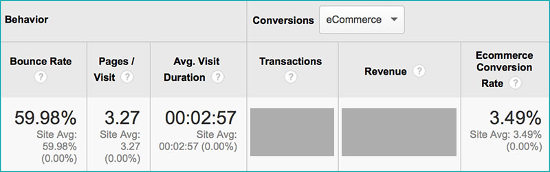
A 4% conversion rate… 60% cart abandonment. For my particular business these figures were terrible. Economic impact? Major.
What is UX?
UX stands for user experience – the experience that users have when they browse and interact with your website. I could bore you with my botched, lengthy definition of UX, but you’ll find a far better definition here. The bottom line is that good UX converts more shoppers to buyers.
Identifying the problem
The UX on my website is just one of main components that goes into determining my overall conversion rate. Things like the quality of traffic also play a huge part. The majority of my website’s traffic comes from highly targeted paid clicks on PPC networks like Bing and AdWords – so I could safely rule out the “low quality traffic” possibility. There were a couple of other considerations I looked into, too, like my pricing. Again, my prices were cheaper than most competitors – I was confident my prices hadn’t spawned these dreadful figures.
That led me to UX optimization. When I first launched the website, my girlfriend had a lot to say about it – most of it negative. I swept her comments under the carpet initially because I was so excited to launch the site. A few months later is when I realized the metrics could use some love.
A nice dinner and expensive bottle of wine later, I asked her to once again audit my website – writing down her exact thoughts. I then asked her friends to do the same. They all mentioned the same things: the category/brand buttons in the top navbar weren’t obvious (they didn’t look “clickable”), the product descriptions were a bit “boring”, product pages had no quantity select function, and it was all too easy to get lost during the checkout process.

Cart abandonment emails
My immediate thought was to take advantage of cart abandonment emails. It took me a little while to set them up (they’re now offered as a feature in the higher-end Shopify packages). Yet, in all the time I ran them, I had five people actually come back and pay for the items in their cart. That’s a pretty poor return.
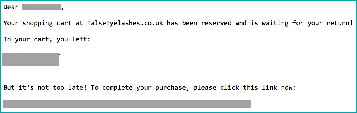
Cart abandonment emails are handy to have, but don’t go and break the bank in order to implement them. Typically you’ll find that once a customer has gone, they’ve gone for good. Instead of trying to lure them back, you should look at ways to retain their attention and have them complete the purchase on your website upon their first visit.
If I’m being honest, I was attempting to bury my head in the sand a bit with the cart abandonment emails. They weren’t the solution to my poor navigation and boring product descriptions. Luckily for me in fact, cart abandonment emails didn’t work very well early on – so I was forced to look deeper into the actual problem.
Audit your competitors
After deciding my UX was having a negative effect on my bottom line, I wanted to take drastic action. I did a quick Google search for “user experience audit” and “user experience improvement” – somehow I managed to get through to two agencies charging in excess of $9,000 for their services. Paying that kind of money was simply out of the question. Instead, my girlfriend asked me why I didn’t just audit my competitors’ websites instead. That was a great idea!
Before you go out and get yourself in lots of trouble by cloning your competitors’ websites, read this paragraph very carefully. I’m not saying you should go out and lift their entire website by copying their design or code. I’m saying you should research your five biggest competitors, then go through the whole UX on their website. Pay attention to the way their sites are laid out, look closely at the way their product pages are displayed, and note how their checkout processes work.
After auditing the websites of my five main competitors I noticed some big similarities between them all. All of them place a large emphasis on “secure payments”, having various logos and graphics on their pages. My competitors all have clear ways for users to browse their website – they can browse using category and sub-category links from the main navbar. They also have drop down menus allowing users to refine the selections they’re browsing.
Four of my five competitors use orange “buy” buttons. Three of my competitors feature social sharing icons towards the top of product pages (I assume for social proof). Two of my competitors use reassuring sentences and words on the cart/basket page in order to instill trust in their potential customers (and have them proceed to the payment page on checkout).
Overall layout
Clearly the buttons in my navigation needed to be changed – my girlfriend and her friends all pointed them out as being poor. It took a coder around 10 minutes to tweak them so they looked more prominent and obvious (many ecommerce platforms nowadays have different style options to choose from so you can change these out easily). I also made sure more buttons were added – so users could browse by product type, or by brand.
I’ve always struggled when it comes to laying out and categorizing products on websites, so I had to work really hard to get it right. There’s no point in buying lots of great stock if it’s inaccessible to users when they browse your website. Working out how you’re going to make every item accessible and prominent can be a challenge, but with a bit of creativity you’ll get there (again, look at how your competitors do it for inspiration!).

Amazingly, my website didn’t have a quantity select option on product pages. Customers could hit the “buy” button, but they could only buy one of every item (unless they hit the “buy” button multiple times.) This was a glaring flaw in my website – it meant I’d probably missed out on the opportunity to increase average check by having people buy multiple items from me, instead of just the one. I addressed this flaw with a super-simple quantity select box, going right up to 50 items.
After hitting the “buy” button, there was no confirmation message to tell customers that the product had been added to their cart. The button didn’t change color when customers hovered their mouse over it either. I rectified this by adding a “thank you” pop up message to confirm items had been added to customers’ baskets.
The way my internal search results were returned was also a headache for me. Initially, the search output look like Google’s organic results – which was a really poor idea. It meant the UX on my website was inconsistent – category pages looked nice and they were styled perfectly, yet users performing a search for a specific product were shown a drab white page, with results in organic-style lists (no product pictures, prices, etc.).
Buttons and colors
As I mentioned earlier, most of my competitors seemed to employ the use of orange buttons, especially orange “buy” buttons. I doubt there’s any coincidence in that, but it’s always something you should test (more on this later). I also made buttons change colour when the mouse hovered over them – this was based on feedback offered by my girlfriend and her friends. It helps a customer feel the interaction between my site and their intention to click.
Having spoken to a few UX experts, it seems I placed a little too much emphasis on the color of buttons, I’ve been advised changing the color usually has an affect of 0.5% or less on conversions. That doesn’t mean experimenting with different colors isn’t important, it just means there are bigger fish to fry on your website. That said, I’ll happily take a 0.5% increase in my conversions any day.
Calls to action
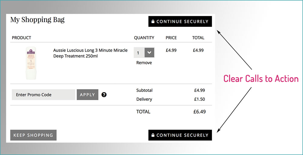
I’m a huge fan of calls to action (CTAs) – I’m firmly of the belief that you must grab your customers by the hand and lead them through the checkout process. You can’t afford to leave anything to chance, or you’re leaving money on the table.
![]()
Use CTAs throughout your website: “Buy it Now”, “Add X for Free Delivery”, “Pay Now”. You have to tell the customer what you want them to do! 50% of ready buyers might complete the checkout process intuitively, of their own accord – the remaining 50% will result in lost sales.
I could write a book about calls to action, and how you can use them to manipulate and encourage the behavior of your users – sadly I don’t have time. To that end, audit your use of CTAs, look for opportunities to take users by the hand and drag them through your website’s checkout process. The sooner you tell your users what you’d like them to do, the sooner they’ll start doing what you’d like them to do.
Consequently…
My UX improvements have lead to a small percentage increase in conversions. That’s good, because a 1% increase in conversions equated to a 20% increase in the total number of sales. If I can increase my conversion rate (CR) to 10% in total, I will have more than doubled the total sales figure I started out with, and more than doubled my profits.
Don’t assume that a “small” 2% increase in conversion rate isn’t worth fighting for – in my case a 2% CR increase would be a 40% increase in the total number of sales!
It’s too soon to start posting screenshots and to claim my improvements have worked. As with everything involved with ecommerce, the smallest factors can have a huge effect. I’m going to give my tweaks six months to propagate so I have some solid figures to work with. Let’s just say, even at this early stage, I’m on track to hit that 10% figure.
The perils of benchmarking
During the process of improving my website’s UX, I heard various people mention conversion rates I should use as a “benchmark” for my website . Don’t get bogged down with “benchmarking” your CRs to figures spouted by some plastic guru. The only figures you should ever benchmark your business to are your competitors’ – and the chances of you getting your hands on those figures linger around zero.
Instead of benchmarking, work with the figures you’ve already got and look to improve them. Benchmark your improvements based on your figures and your business. Every ecommerce niche out there has a different average conversion rate. CRs for high value commodity purchases tend to be minuscule – whereas CRs for low value, cosmetic products tend to be higher.
To conclude…
Overall, I managed to save a lot of money by “bootstrapping” the UX improvement process. I didn’t pay an agency, instead I asked for feedback on my website from members of my target market (which happened to be my partner and her friends) – I then acted on their feedback and looked at the way competitors were doing things. Don’t have anyone to ask? Join a forum or community group or post on the ecommerce sub-Reddit. You’ll be surprised at how willing people are to provide feedback and help you out!
Once I’ve gauged the impact of these changes, I’ll look into A/B testing different parts of my website. Just like PPC, your conversion rates are never truly optimized – there’s always an extra 0.1% here or there you could squeeze out, simply by testing. But that’s another post…
For now I’m grateful for the slight sales increase I managed to gain – all it cost was a nice dinner, a bottle of wine, and a couple of hours of development work.
When was the last time you gave your UX some love? Isn’t it time you started?