Just like any brick-and-mortar shop, your e-commerce site needs to be carefully curated to attract buyers.
It’s not just a matter of sleek graphics and motion effects. Your design needs to employ UX principles that create a seamless shopping experience, so there’s no resistance towards reaching the final checkout.
Besides reducing friction, the site should reflect your brand’s value through a clear, intentional style. Having a professional, unified “look” gives buyers an idea of what your business is about and reads as a sign of your products’ worth.
All together, your site design should build an emotional connection between you and your buyers. Allen Burt, Managing Director of BlueStout.com, describes the value of this emotional design for your bottom line.
The #1 way to increase conversion on your store is by creating an emotional experience and connection with your customers to the product. Customers buy first with emotion, and justify with logic afterwards. A brilliant store design, that connects with the customer on an emotional level, will do more for a site’s conversions than anything else.
To help you connect with customers, we’ve collected 50 of the best e-commerce web designs to learn from and give you inspiration. In their own branded ways, these sites use engaging, UX-friendly design to capture visitors and lead them towards purchases.
Apparel
1. Allbirds
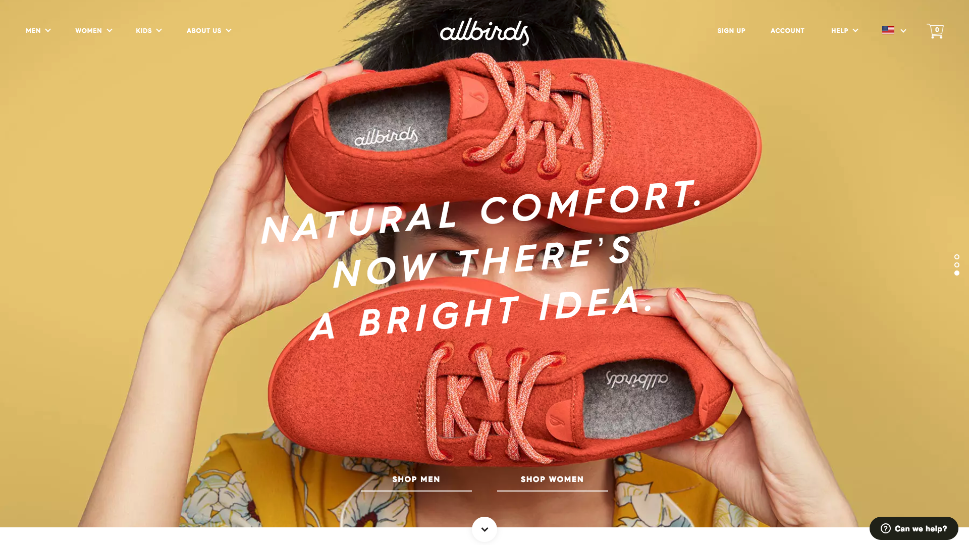
The eco-friendly footwear company Allbirds uses color and spacing to highlight their product’s value. Against the muted yellow background, the red color of the shoes sticks out and makes the site visitor immediately focus on the product. Beyond this contrast, the brand’s value proposition “natural comfort” is placed right in the center, so visitors immediately understand why they should buy a pair.
2. Everlane
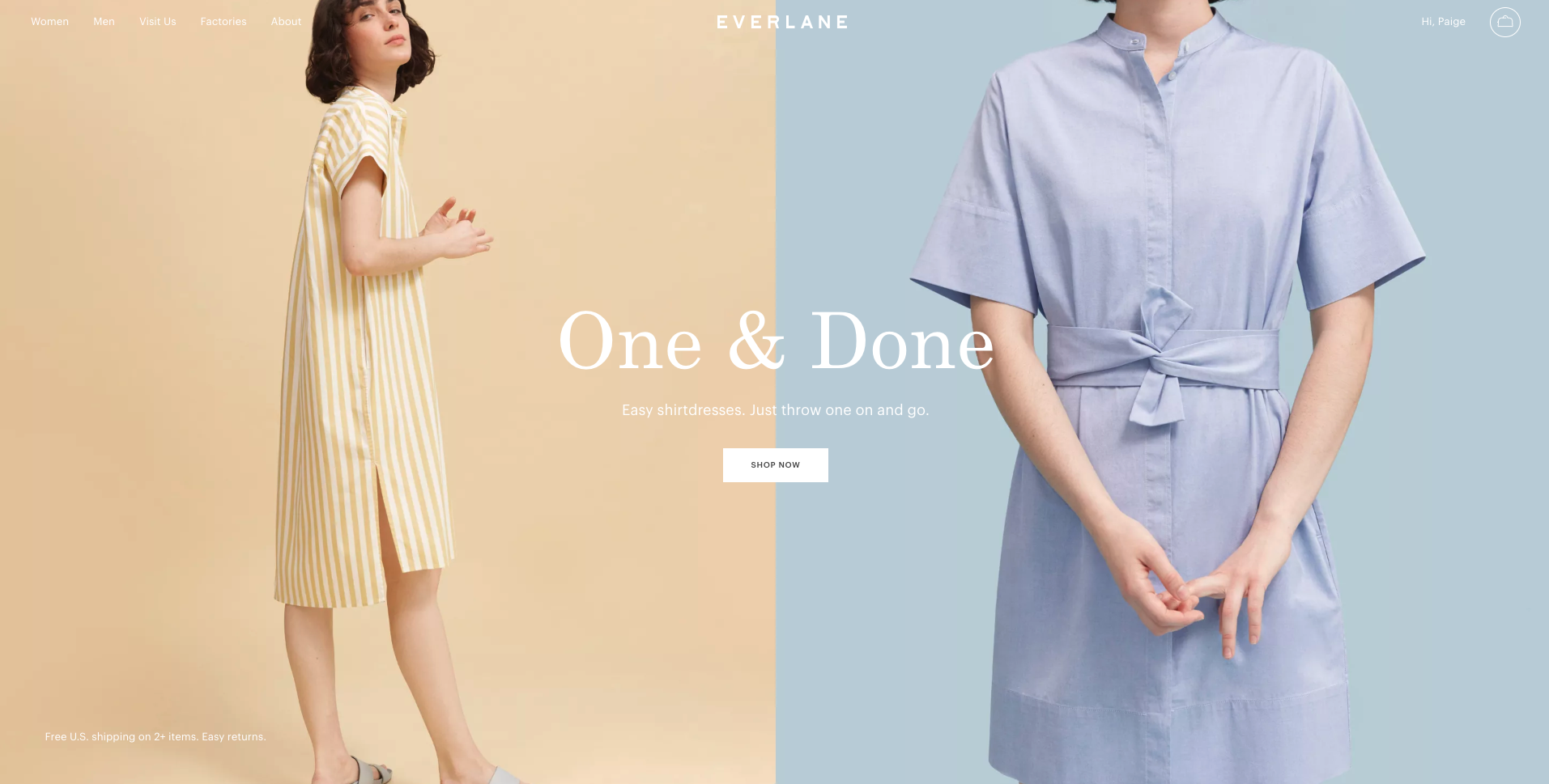
The clothing store Everlane uses high-quality photography to prove to visitors that their product will deliver. First, visitors read why these shirtdresses are worthwhile—you can “just throw one on and go.” The crystal clear images defend this promise by showing how the dresses have minimal buttons, yet also are unwrinkled and crisp. After seeing how easy and appealing the outfit is, visitors can easily make a purchase with the “Shop now”CTA at center.
3. MeUndies
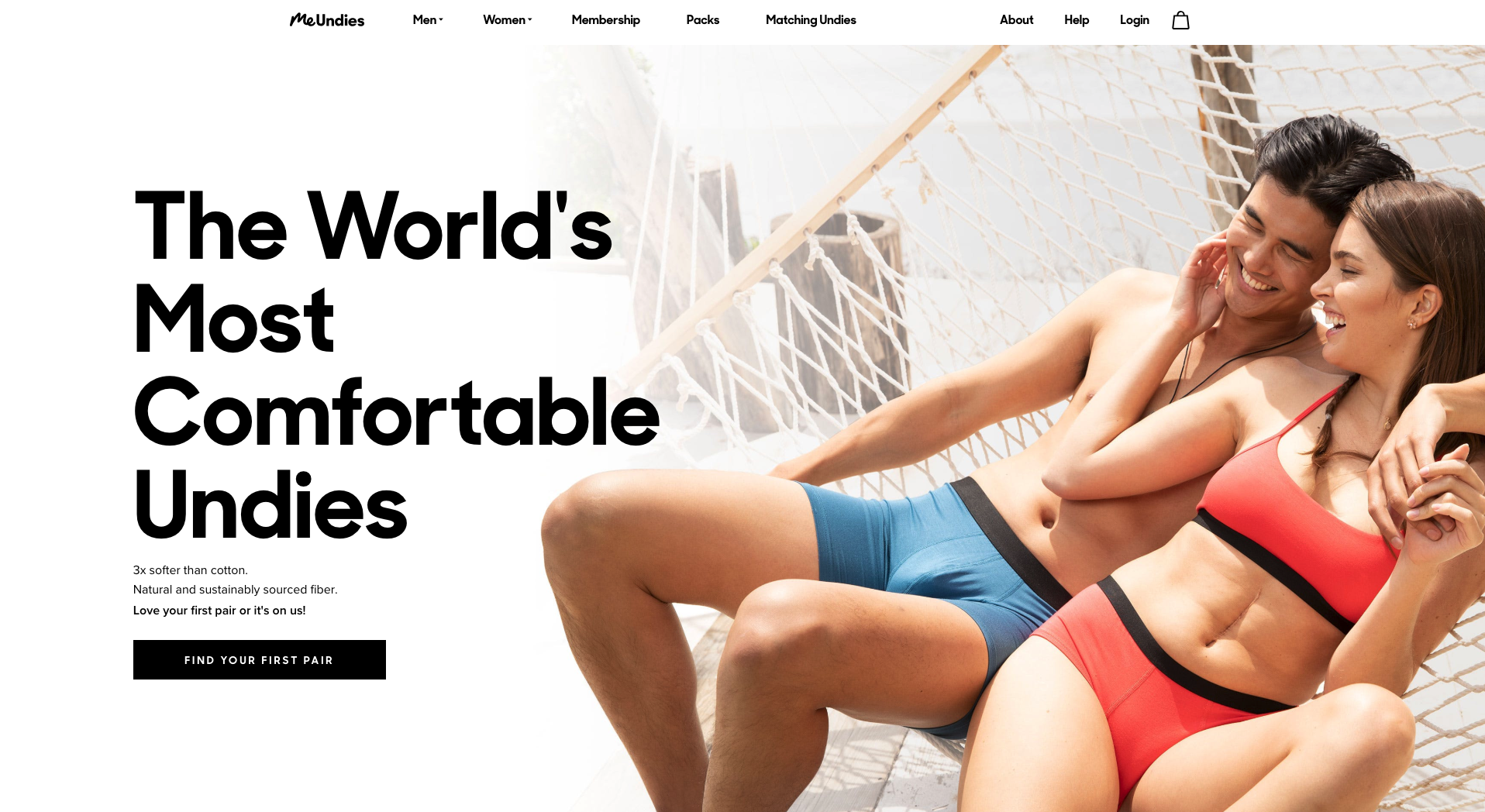
The underwear company MeUndies uses color to showcase their product. The site design mostly uses a black-and-white color scheme, which allows their vibrant product photos to stand out and shine for visitors.
4. Knotty Tie Co.
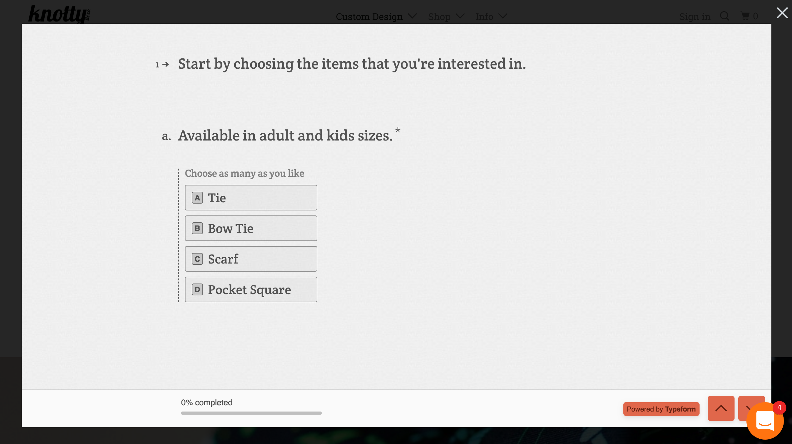
The tie company Knotty Tie Co.‘s unique value is its custom design offering. To make sure visitors can immediately appreciate this value, Knotty Tie Company allows people to fill out the custom design survey without signing up. This survey design eliminates friction and allows more visitors to explore their products.
5. Outdoor Voices
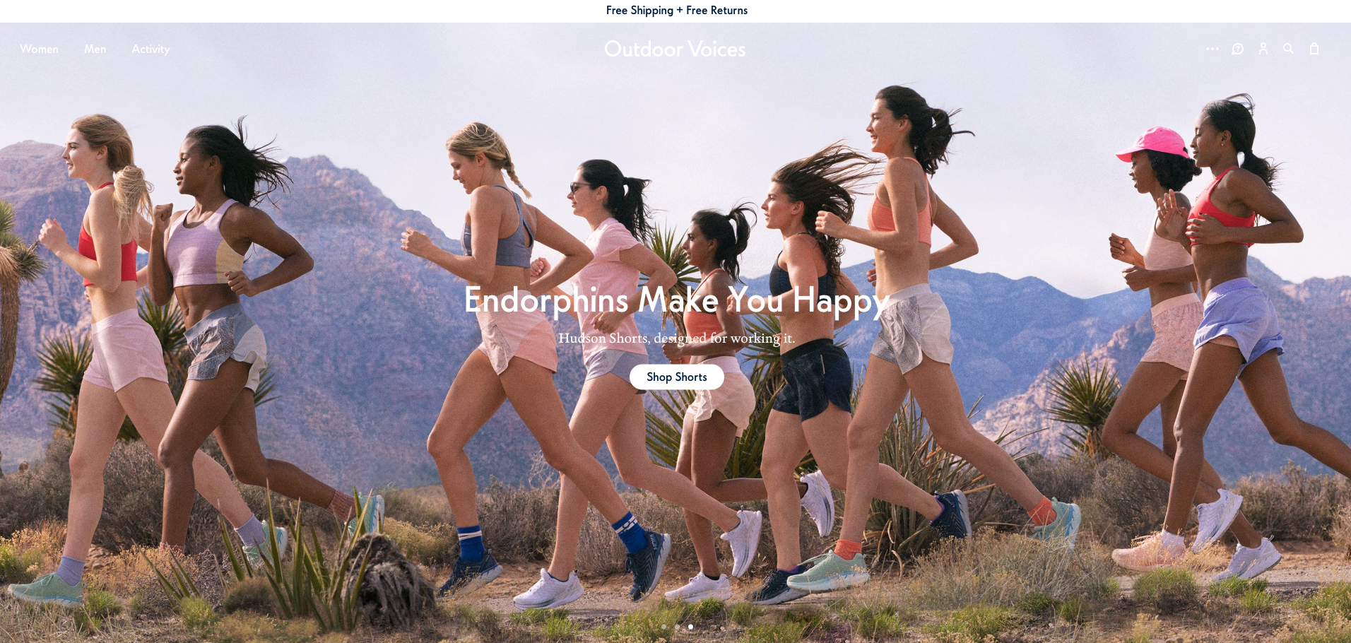
Instead of having a separation between the menu and photo, the activewear company Outdoor Voices lets the image extend into the menu. This makes the photo more immersive, so visitors can instantly imagine themselves running outside wearing their apparel. Ready to browse, visitors can easily find the CTA since its white color sticks out and it’s at center.
7. Hardgraft
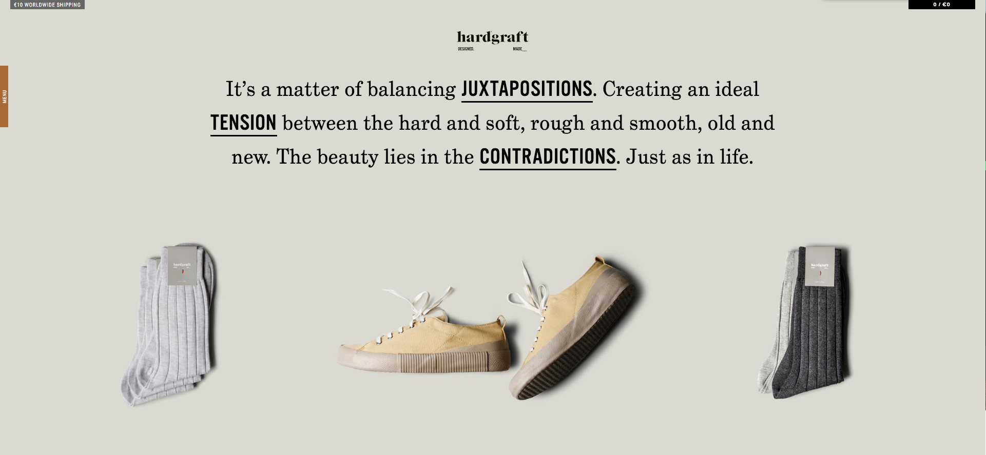
The luxury men’s fashion company hardgraft expresses their beliefs about style through text to sell their brand to visitors. The bold language is enlarged in the product statement to catch visitors’ attention and make them feel that apparel is expertly crafted.
8. Chubbies
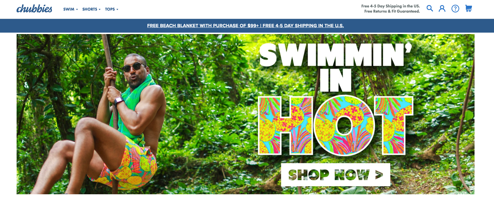
The swimwear company Chubbies uses bright colors and photos to get visitors in a fun vacationing mood that excites them about making a purchase. On their homepage, for example, they showcase their vibrant swim trunks in a tropical jungle environment.
9. Alice + Whittles
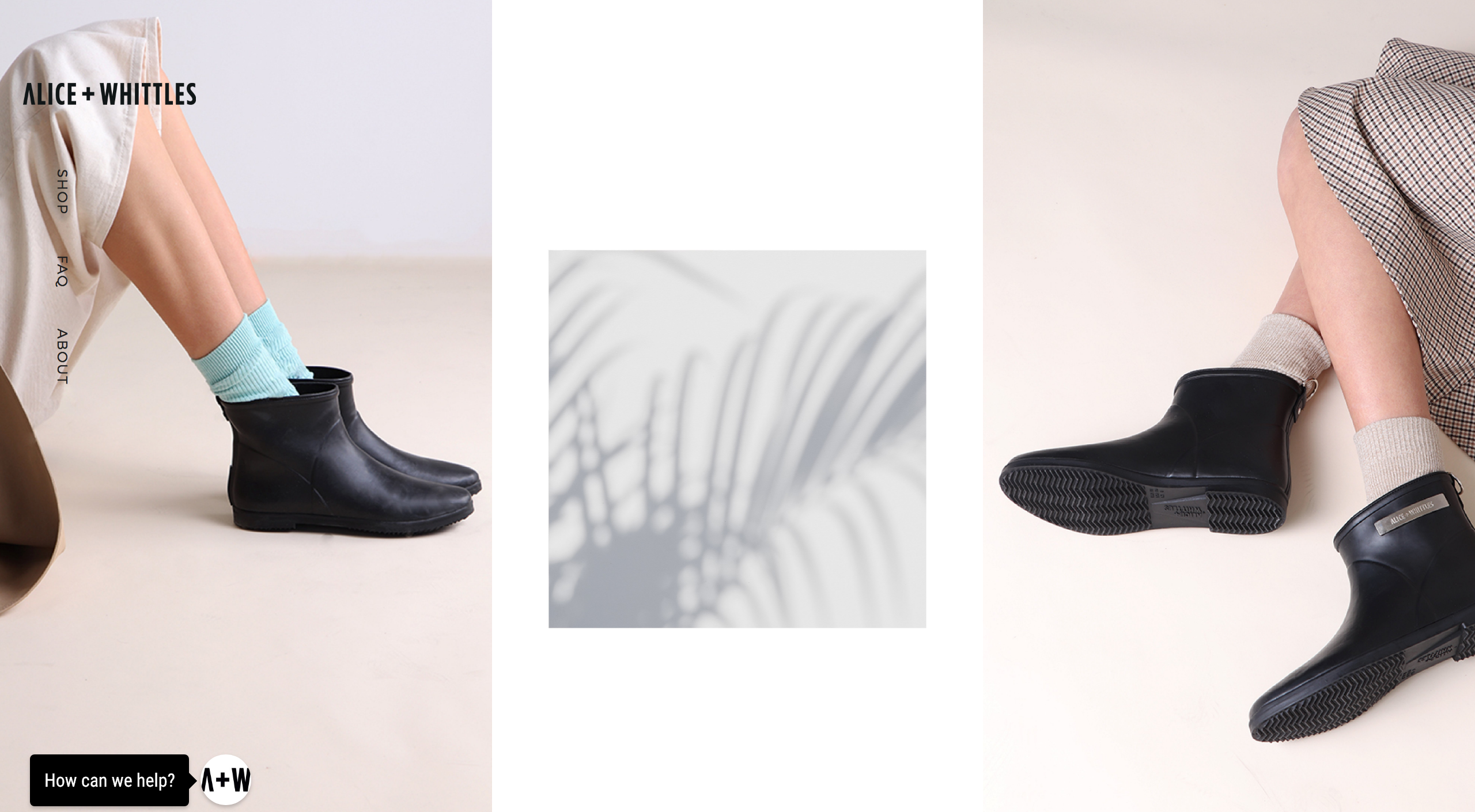
The boot company Alice + Whittles uses a clean design to reflect their own products’ value: minimalist, yet high quality. Just like the brand’s small selection of black boots, the photo-oriented site feels uncluttered yet well done. The design’s bare-bones feel will capture the attention of visitors who are looking for essential, timeless footwear.
10. Fiercely
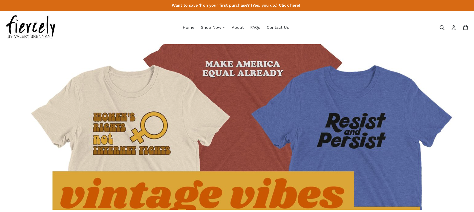
The t-shirt company Fiercely uses product photos and text to highlight what makes their tees unique: vintage design with a modern message. Visitors on the homepage can immediately understand this value with the prominent “vintage vibes” text and clear photos of the graphic tee messages.
11. Solstice Intimates
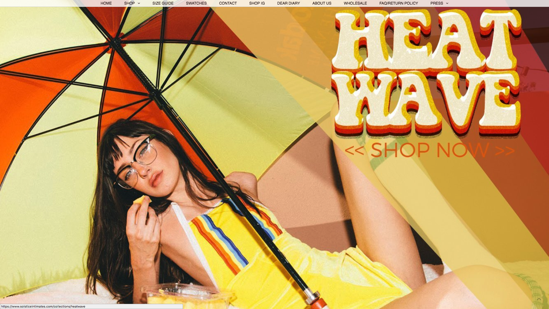
Unlike most sites, the swim and lingerie store Solstice Intimates catches visitors’ attention through their photos’ low quality. Many of their product images are slightly blurred to create a vintage, gritty feel that their target buyers are looking for. Of course, the takeaway isn’t to use low-quality photos—it’s to capture the style of your brand and key customers, even if it means breaking traditional design rules.

Jewelry & Watches & Accessories
12. Wild Heart Jewellery
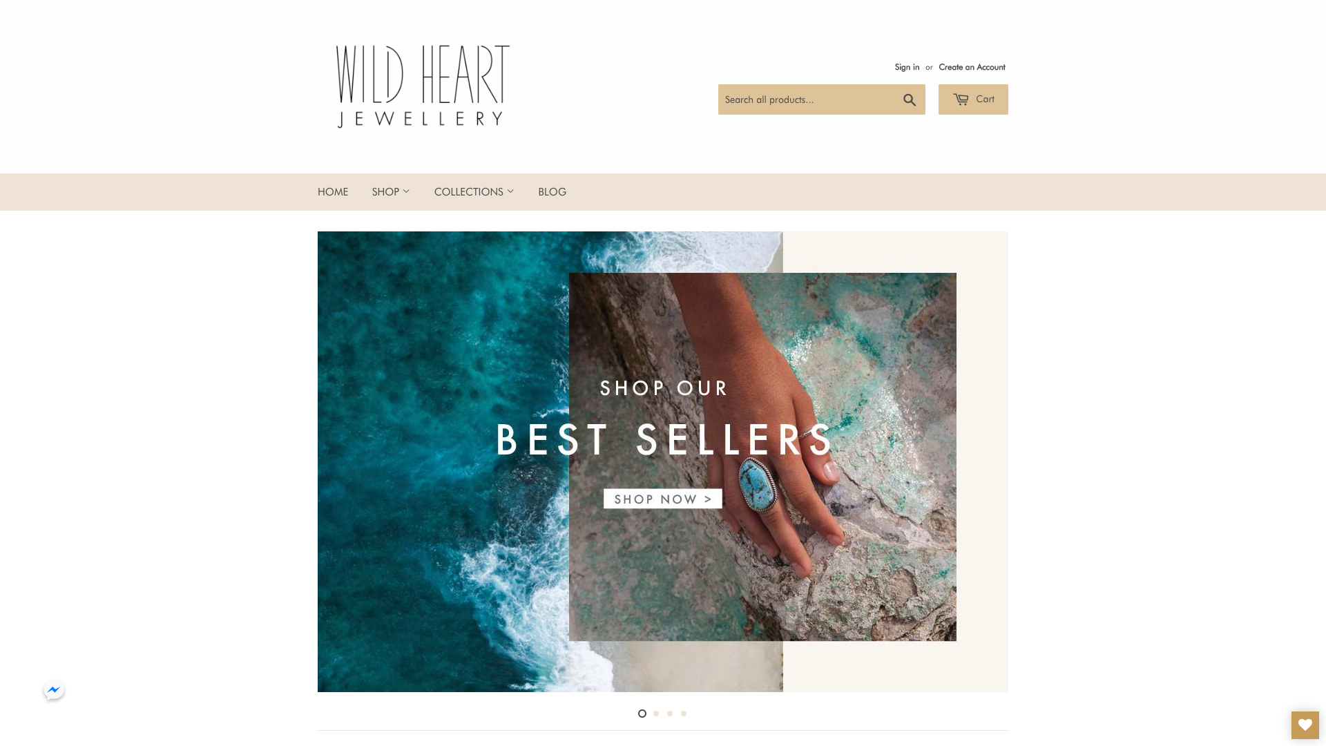
The clean design of Wild Heart Jewellery doesn’t just evoke the minimalist style of its products to attract target buyers—it also makes the site a breeze to navigate. The white background of the store makes it easy to find the beige menu for browsing. And unlike most sites, Wild Heart leaves a lot of white space around the gold search bar at the top, so it’s also very simple to see.
13. Away
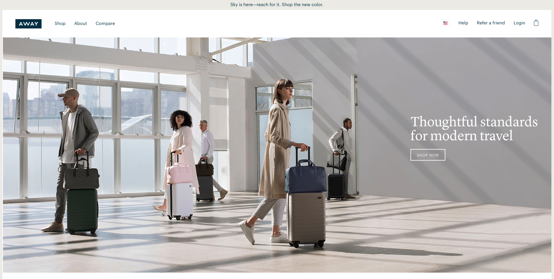
The luggage company Away shows their products’ value through strategically stylized images. Besides being high resolution, the images make the products look great because the models are dressed to coordinate with the suitcases, as in the example above. With a beautiful, fitting palette of colors to look at, the products look stunning in the eyes of visitors.
14. Skagen
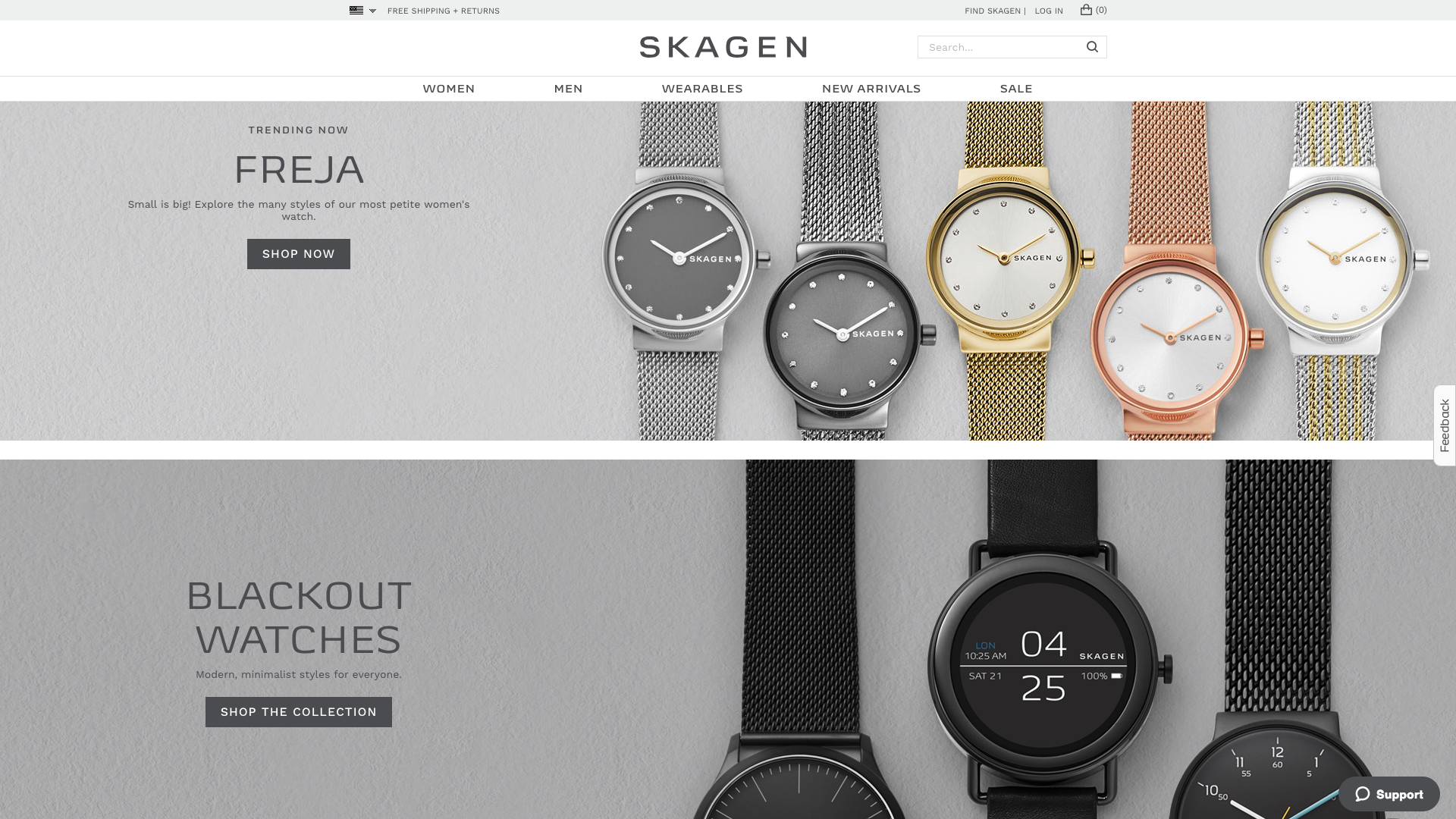
The watch company Skagen uses close-up, high-resolution images to show off their products’ value. The crisp quality of the photos, for example, captures the shine of the metal watch face, the clarity of the digital watch screen, and the intricate braiding of the wristband.
15. MVMT Watches
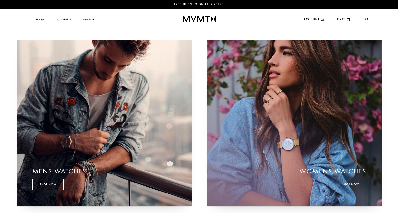
The minimal menu bar of the MVMT Watches site makes the store more attractive and easier to browse. With only three menu options—Men’s Women’s, Brand— there’s a lot of white space on each web page for highlighting the gorgeous product photos. Having a small amount of menu options also makes it easier for visitors to choose one, so they’re more likely to start shopping.
16. Miansai
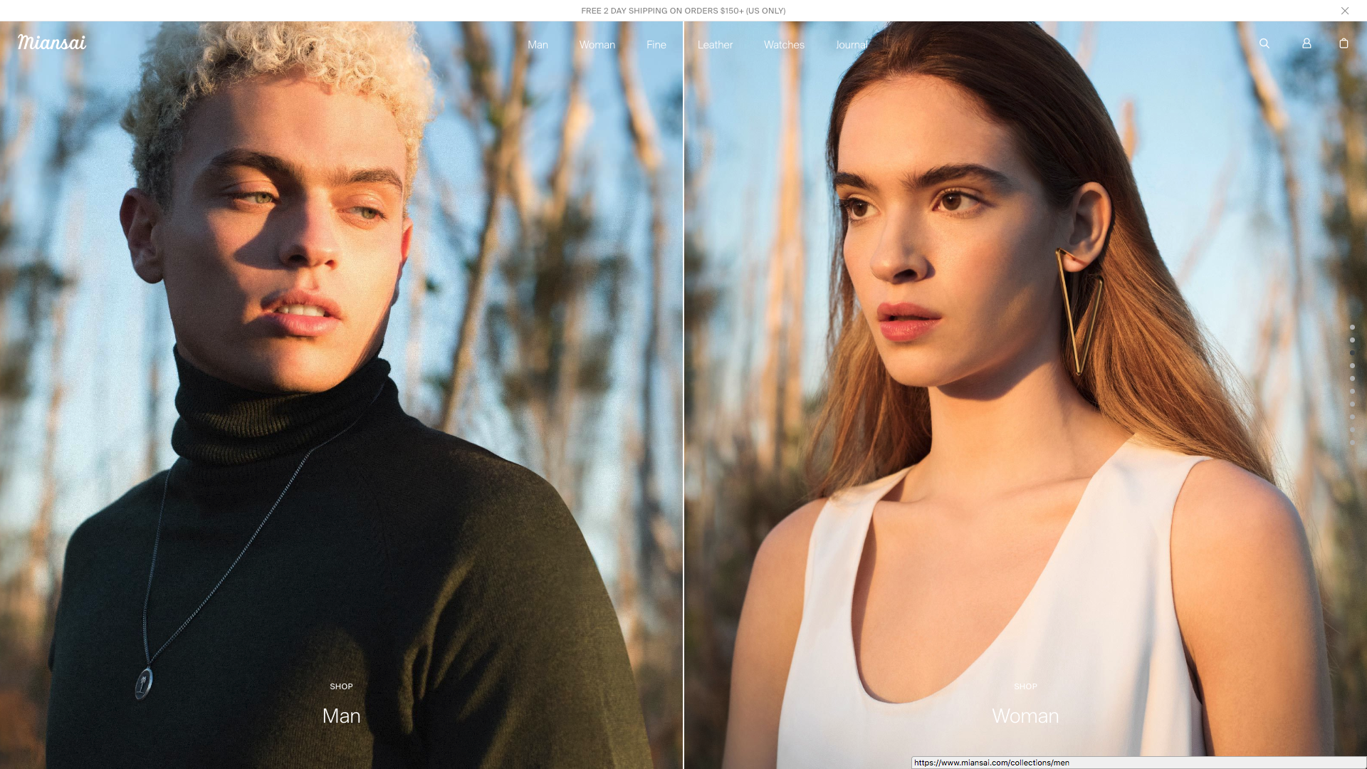
The jewelry store Miansai places a minimal border or no border around most of their photos, so they feel more immersive. The lack of white space around images makes it easy to forget the site is a store, so buyers can easily imagine themselves wearing the products. Envisioning the product use, visitors are likely to start shopping.
17. Warby Parker
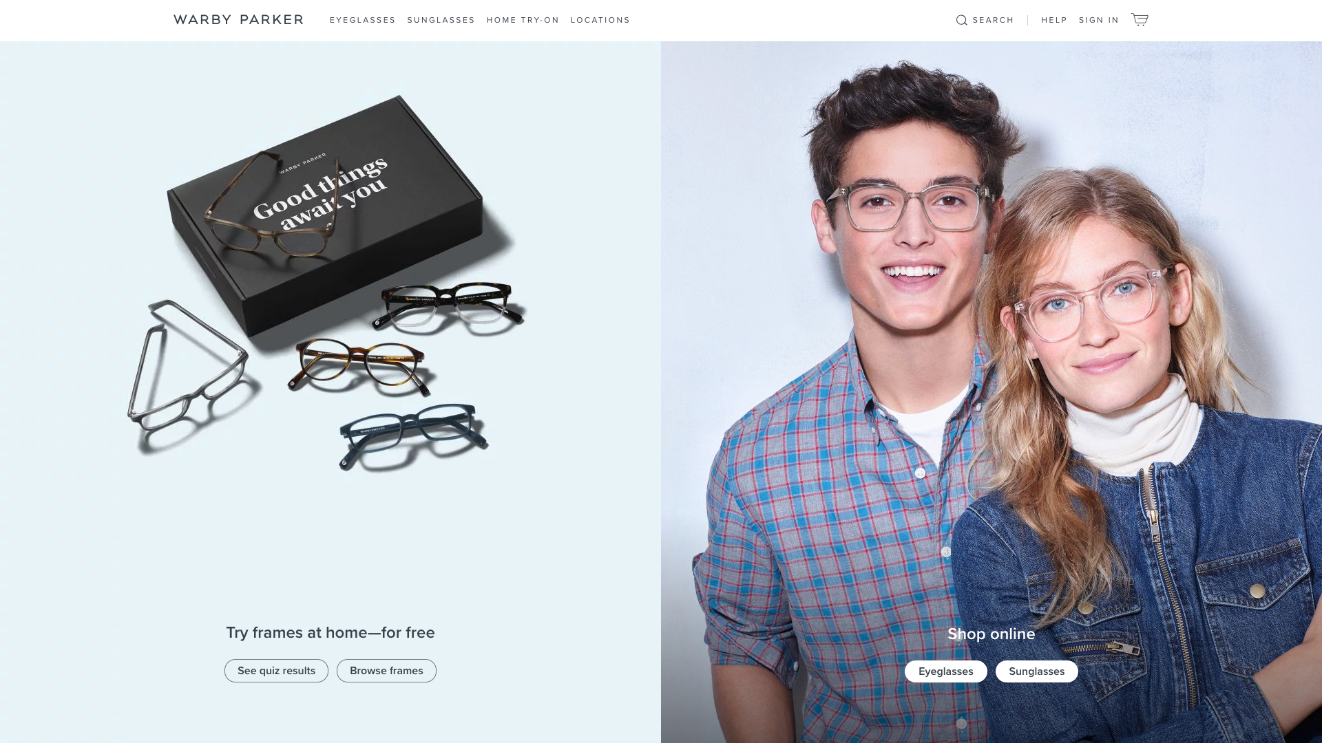
Warby Parker uses a skillful combination of a clean style with fun pastels to attract their target buyers. The minimalist feel of the site attracts their key customers who want thin-rimmed, sleek eyeglasses. At the same time, the use of pastel colors gives the brand a creative, artistic feel that many of WP’s customers value.
18. Stay Home Club
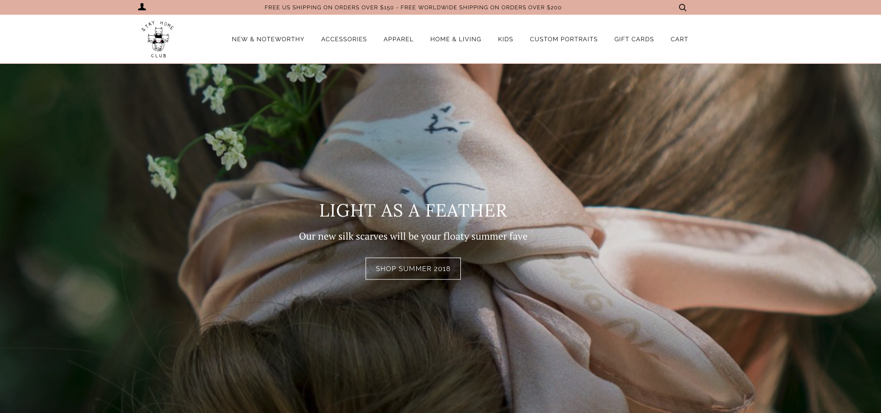
Combining white space with hints of color, the lifestyle company Stay Home Club‘s site is easy to navigate yet still casual and laid-back like their customers. Their visitors can easily find each product category since the menu is uncluttered. At the same time, the tasteful bursts of color against a simple, clean design the store shows their key buyers that the store doesn’t take themselves too seriously.
19. Herschel
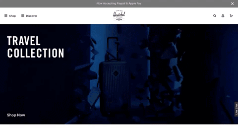
As one of the most engaging mediums, video is strategically placed on the bag company Herschel‘s homepage to intrigue new visitors. The video attracts viewers to the product not only by showing clear details of the items, but also by showing cool effects—such as the blocks breaking—that are fun to look at.
20. Goorin Bros.
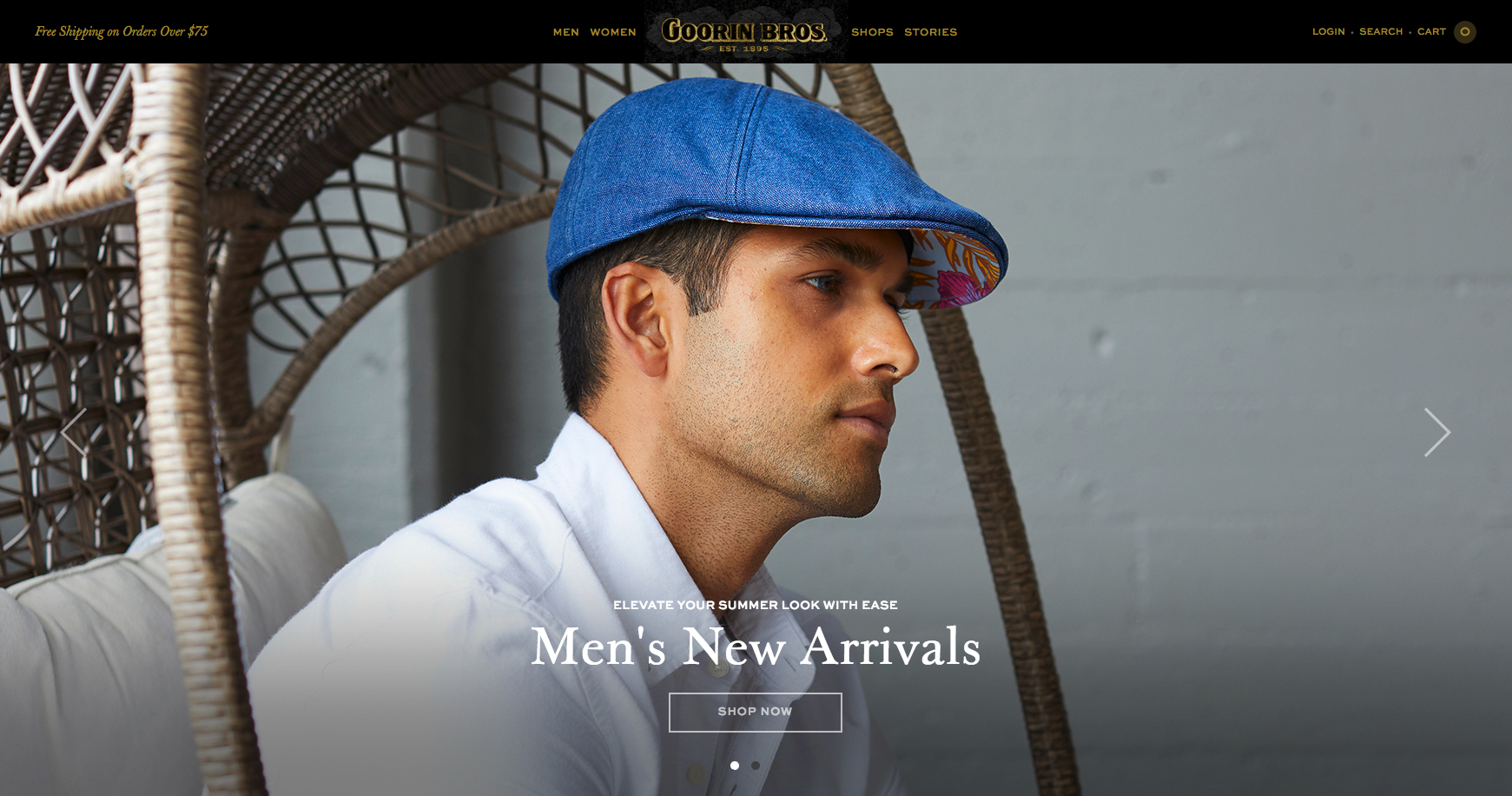
With the hat company Goorin Bros‘ site design, high-quality, crisp images take up the majority of screen space. This placement allows visitors to become absorbed in photos and immerse themselves in inspecting the product.
21. Diff Eyewear
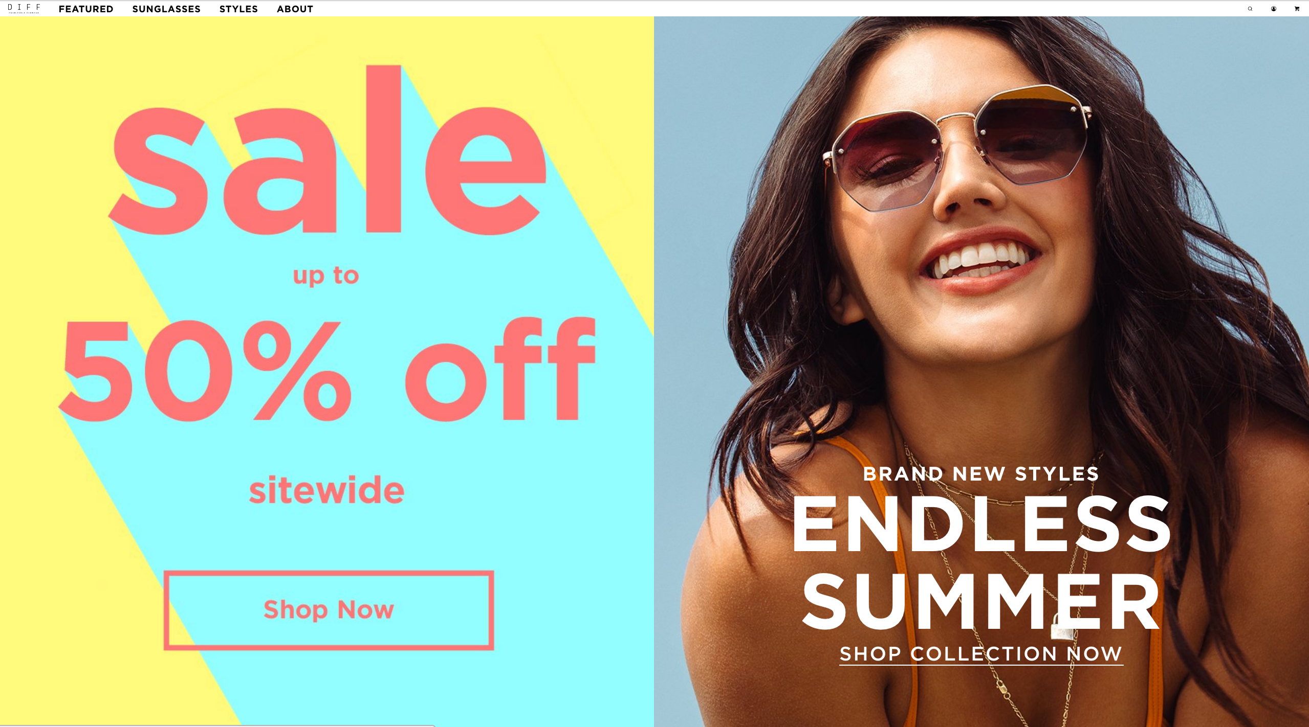
Diff Eyewear‘s design emulates the exciting lifestyle their shoppers want with their products. Bold, energizing colors are used in the promotion images to remind visitors that the brand is fun. Their site also dedicates a lot of space to photos of their sunglasses being worn outdoors, so visitors can easily imagine themselves wearing the product in their own life.
Electronics
22. LOU Board
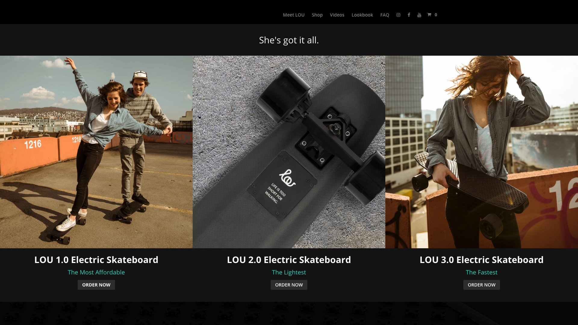
The skateboard company Lou Board uses a black color scheme against action-packed product photos to excite visitors about their products. The black color has an edgy feel that attracts their skateboarding audience, and it also makes the product photos feel more cinematic and engaging.
23. Beats by Dre
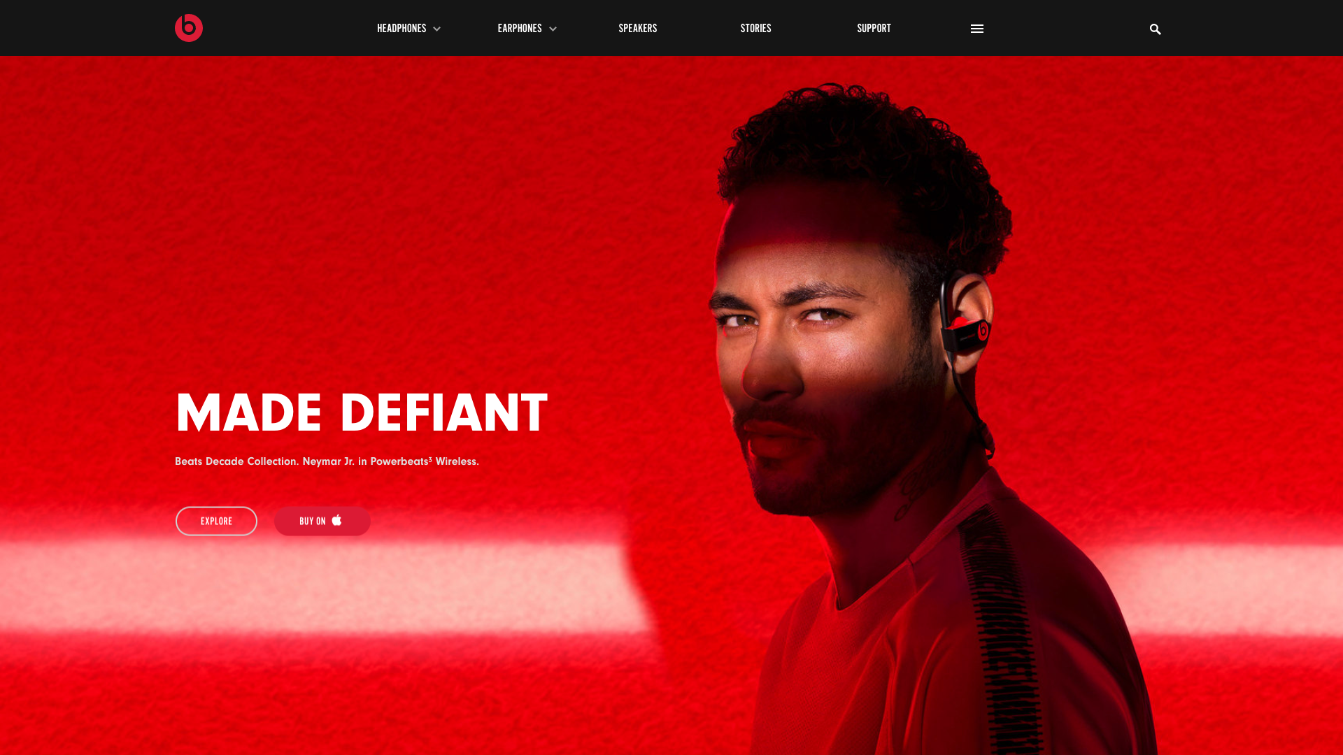
Headphones aren’t the easiest product to promote visually—after all, it’s the quality of their sound that counts to buyers. Beats by Dre still manages to make their site’s design interesting with a loud red color. The company combines the bright hue with other visual elements to lead buyers to shopping CTAs. For example, the white streak in the photo above underlines the “Explore” button against the red.
24. Simplisafe
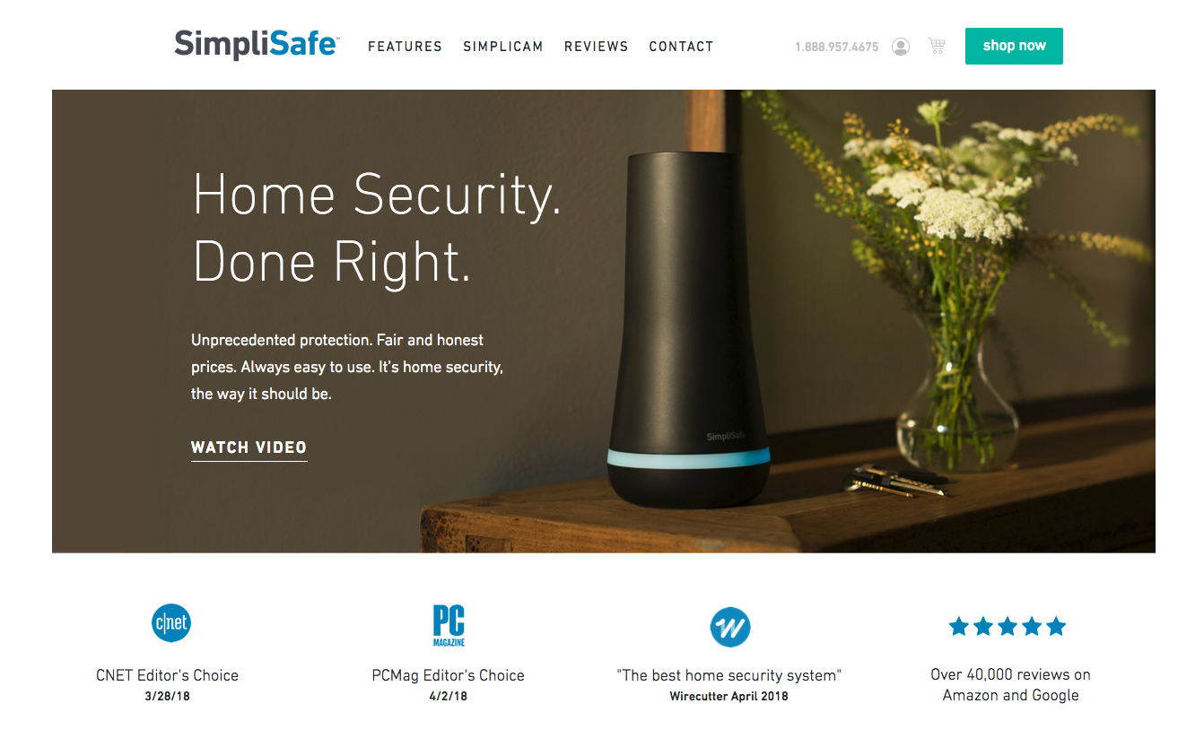
Unlike apparel stores, e-commerce shops for security products need to focus more on conveying their credibility than their style. The home security company SimpliSafe achieves this by prominently featuring their endorsements and reviews right on their homepage. Visitors’ eyes are especially drawn to these endorsements and reviews since they coordinate with the site’s white and blue color scheme.
25. Nest
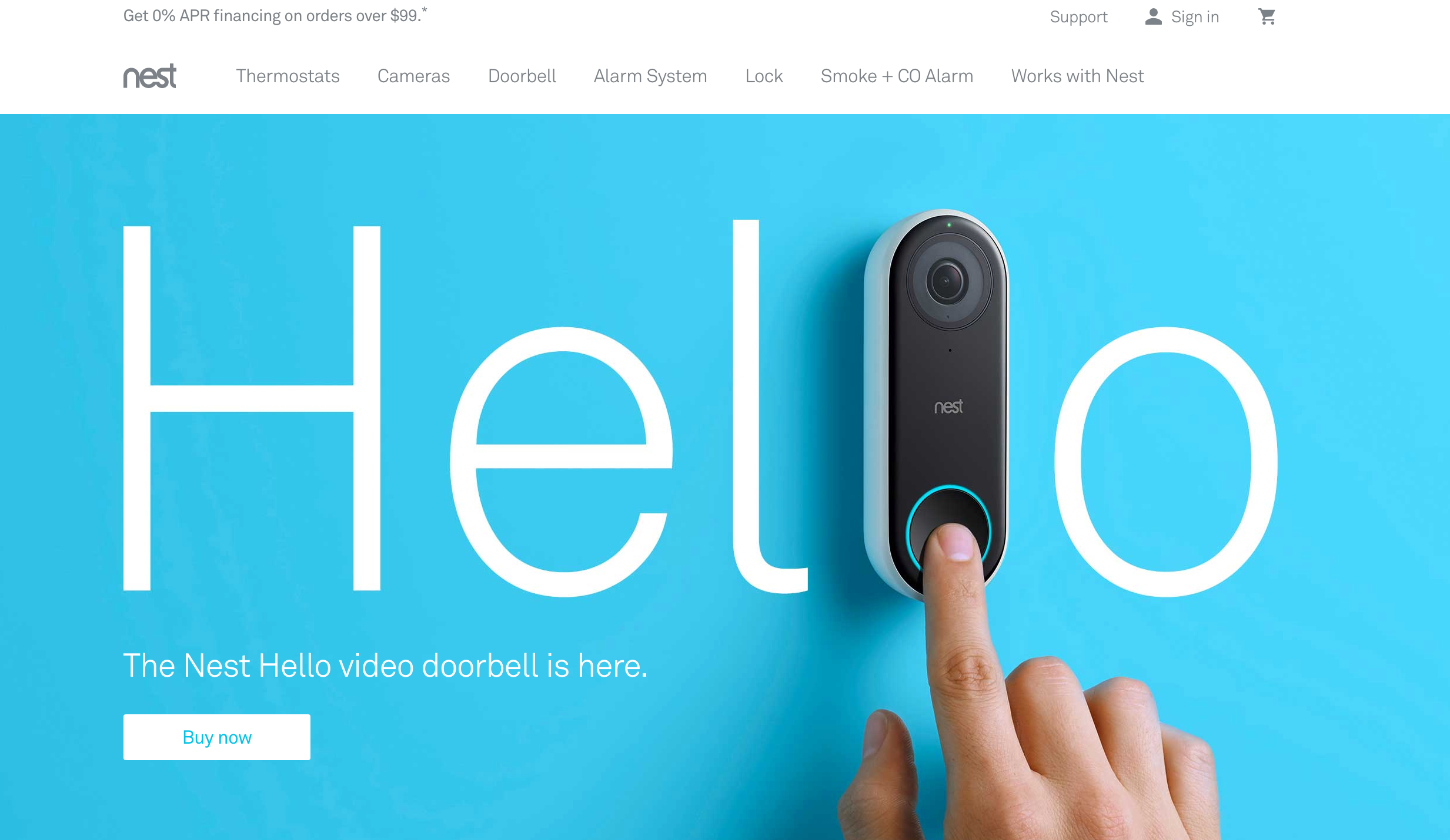
The home device company Nest captures their visitor’s attention with bold uses of color and stunning product photos. On their current homepage, their new product is highlighted with a bright blue background. Captivated by the color, visitors move on to look at the high-quality photo of the doorbell, which shows off how small, sleek, and simple the product is.
26. Bose
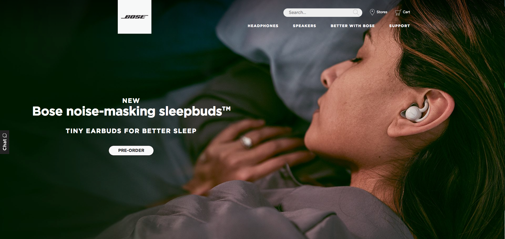
The headphone company Bose draws in site visitors by giving their product photos a lot of space. From the home page to product pages, there are plenty of large, high-quality images to show the product by itself as well as photos with models. These large images let visitors get lost in the product and easily imagine themselves using it, which hopefully drives them to purchase it.
27. Oculus
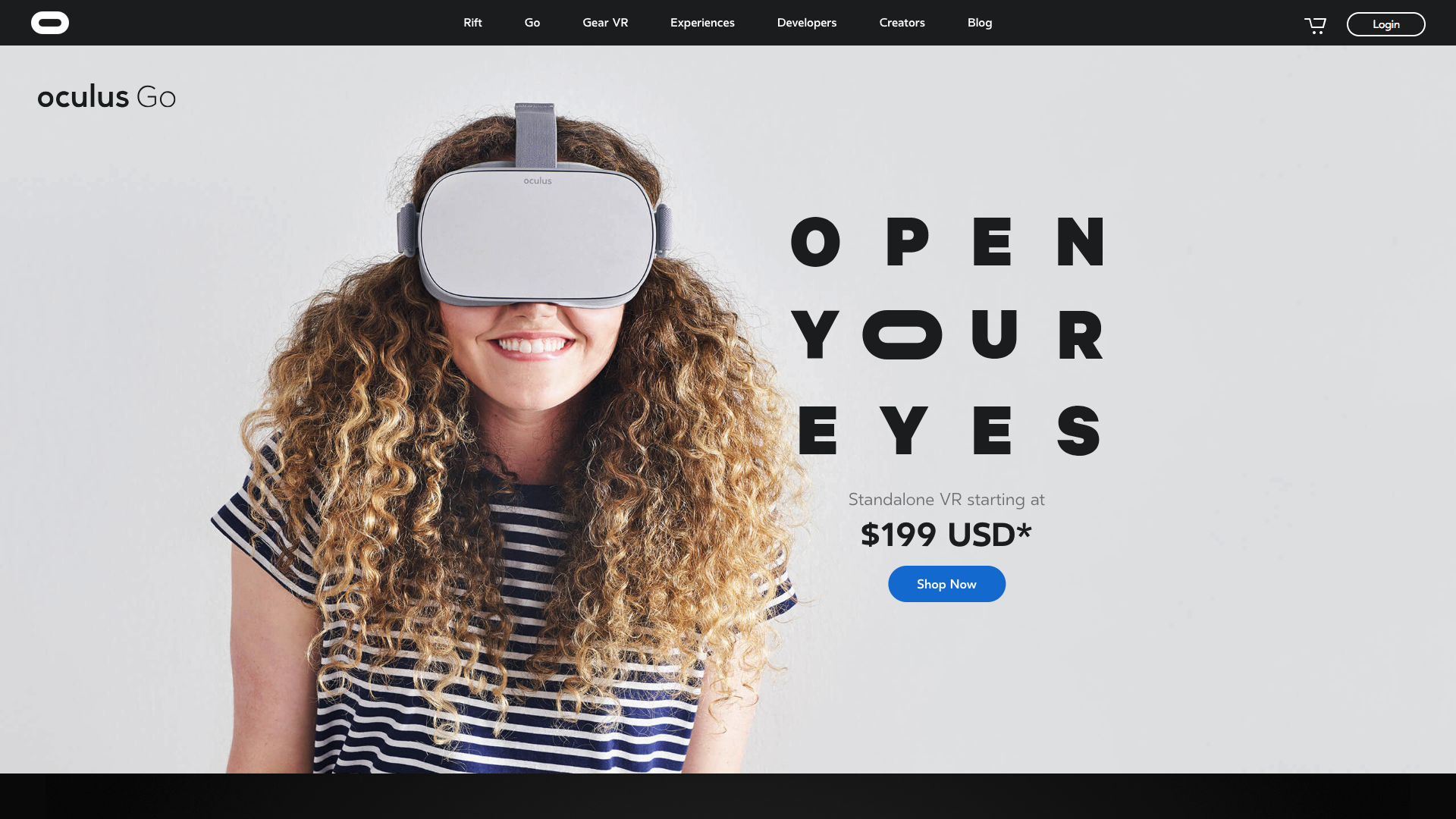
The VR company Oculus‘ site is a lesson in designing stores for unfamiliar products. Knowing that VR headsets aren’t a common product, the site prominently features an image of the product being used and a price point. Without this level of transparency, many visitors would probably feel confused and leave the site. Engaged by the exciting prospect of VR, Oculus visitors can easily find the “Shop now” CTA in blue.

28. Peloton
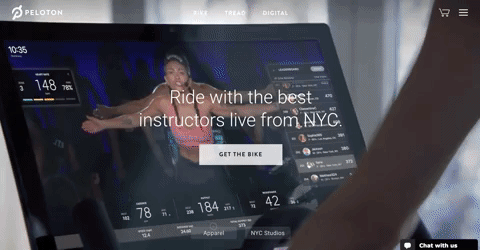
Companies with less conventional products need to clearly show site visitors how the product works so they can appreciate its value. The bike company Peloton does this with a homepage video that plays when entering the site. The video shows users riding the bike from their private home while watching live instructor videos. Seeing the product in action, visitors are interested and want to learn more about the product.
29. Birdi
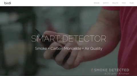
The smoke detector company Birdi uses a combination of text and video on their homepage to quickly show their product’s value. With no extraneous words, the homepage indicates that it’s a detector for smoke, carbon monoxide, and air quality. Behind the text, a video plays to show how the product is used through smartphones. This straightforward explanation of the product through video and text helps visitors instantly understand why Birdi is worth purchasing.
Flowers, greetings, and gifts
30. ProFlowers
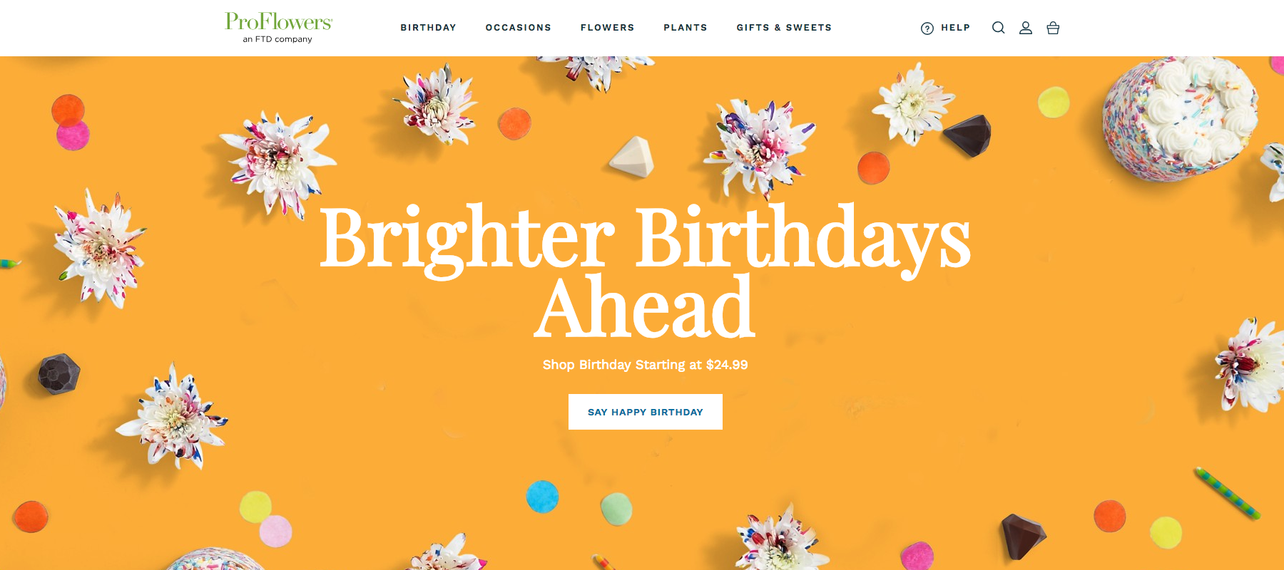
The gift and flower company ProFlowers has a large, varied catalog of products that could easily overwhelm shoppers. To keep their store user-friendly, the site only uses five categories in their main top menu that are each geared to specific customer needs. This organization makes it much easier for visitors to find what they’re looking for without getting lost in other products.
31. The Bouqs Co
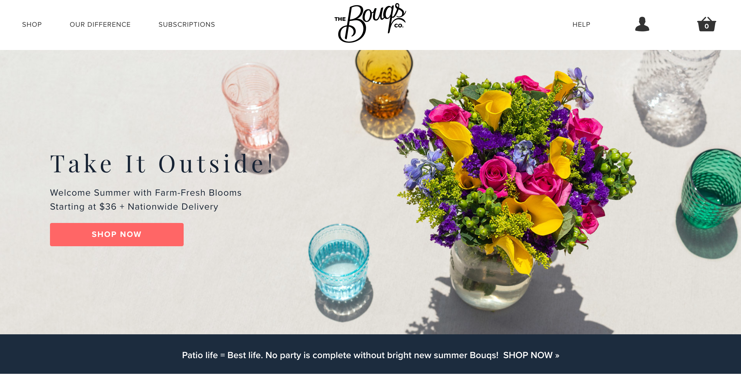
Buying flowers online comes with a bit of friction—most people want to see the bouquet their buying in-person since the presentation takes a level of artistry. The Bouqs Co builds their visitors trust with an elegant, sweet web design that looks as pretty as a flower shop. The product images are crisp and bright, and the site’s color palette features lots of preppy pastel colors.
32. Leaf & Clay
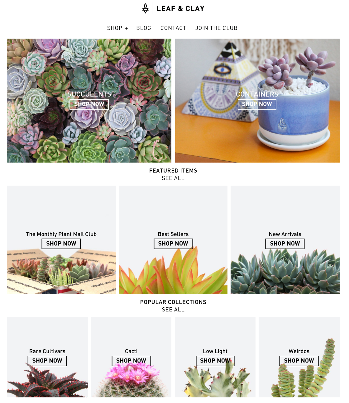
The plant company Leaf & Clay makes their site a breeze to browse through with a unique homepage design. Rather than just putting up a single photo, the store shows multiple photos to indicate the different categories of the store. As a visitor, this design is incredibly helpful since plants are so varied. Seeing pictures brings visitors one step closer to deciding if they want the product.
33. Simone LeBlanc
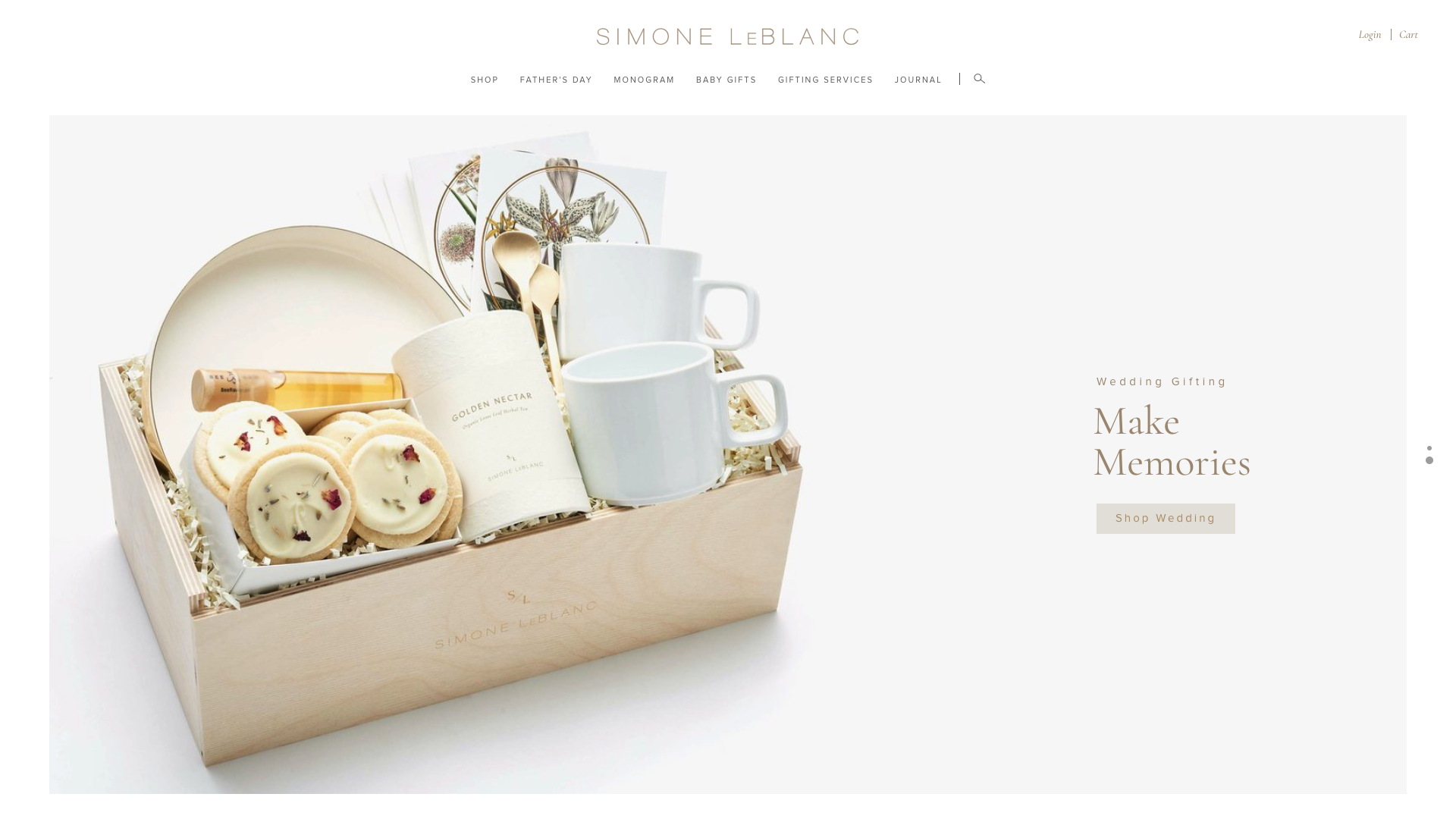
The gift box store Simone LeBlanc uses a lovely ivory color scheme to attract its target buyers, who value elegant, classic styles. The simple colors also make navigating the store a very pleasant, calming experience. Without any distracting elements, visitors only focus on the crisp product photos.
34. FoxBlossom
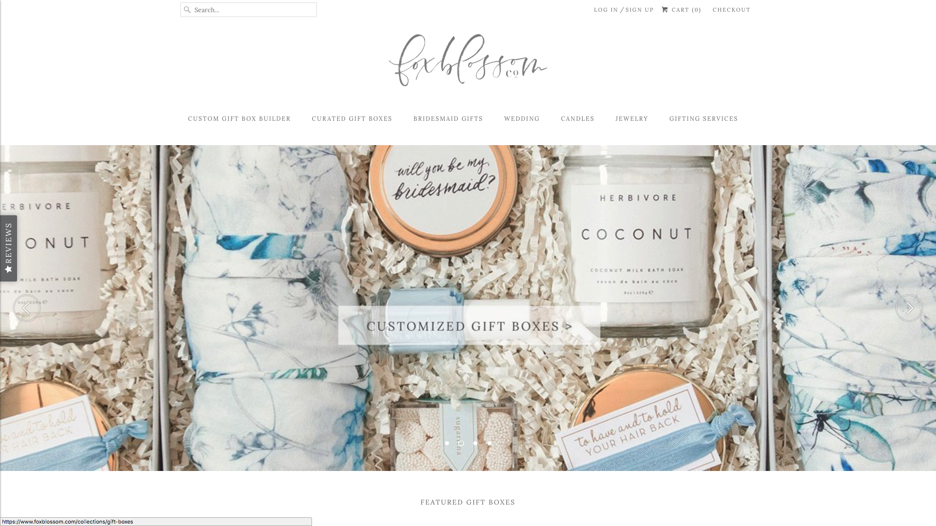
The wedding and gift company Foxblossom uses innovative photo display options to captivate their visitors and encourage purchases. The images are larger than product photos on most e-commerce stores, and the photo for many products shows an alternate image when scrolled over.
Health, beauty & self-care
35. Ritual

The women’s vitamin company Ritual engages their visitors immediately on the homepage with a bright yellow background. The color isn’t just eye-catching—it also gives visitors the energizing feeling that Ritual wants people to associate with their multivitamin. Building this positive emotional association, the color pushes visitors to click on the CTA and learn more.
36. Curology
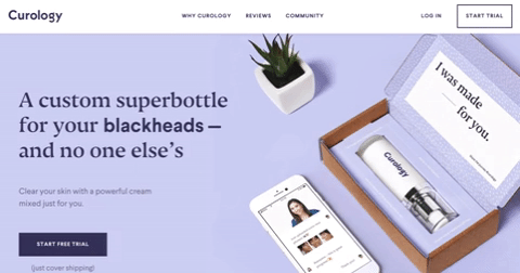
The skin care company Curology knows that they’ll only win buyers if their product helps them solve their pain points. To show visitors how helpful their products are, the homepage text switches to show the different skin issues Curology fixes—blackheads, zits, breakouts, and more. The motion is a captivating way make visitors focus on Curology as a solution.
37. Glossier
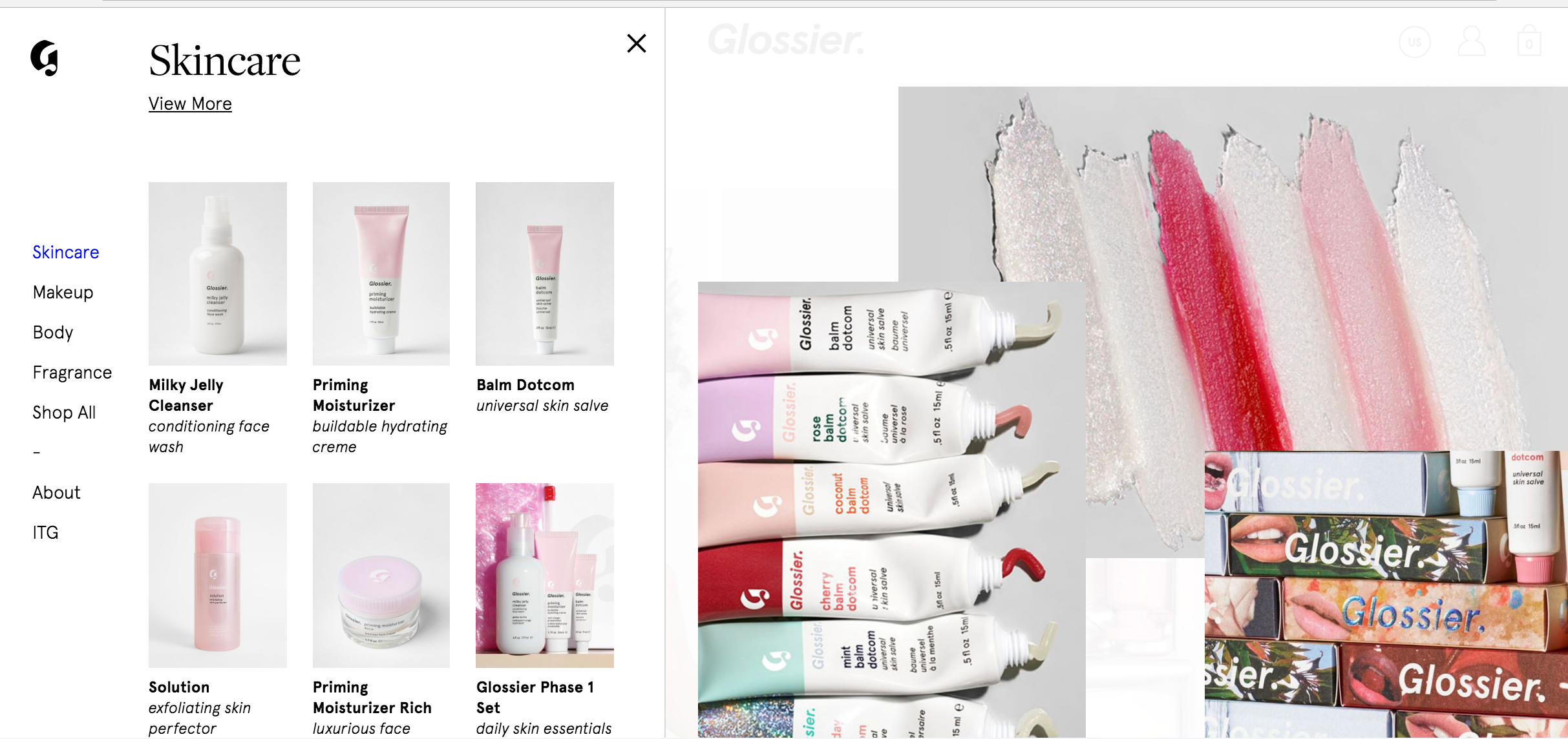
Like any e-commerce store, the beauty company Glossier wants visitors to dive into their site and dig through their categories to find products they want. Traditional site menus though only show text, so visitors aren’t always motivated to keep clicking. Glossier encourages visitors to explore categories with an image-oriented menu. Each category shows previews images of the products it contains.
38. Hairstory
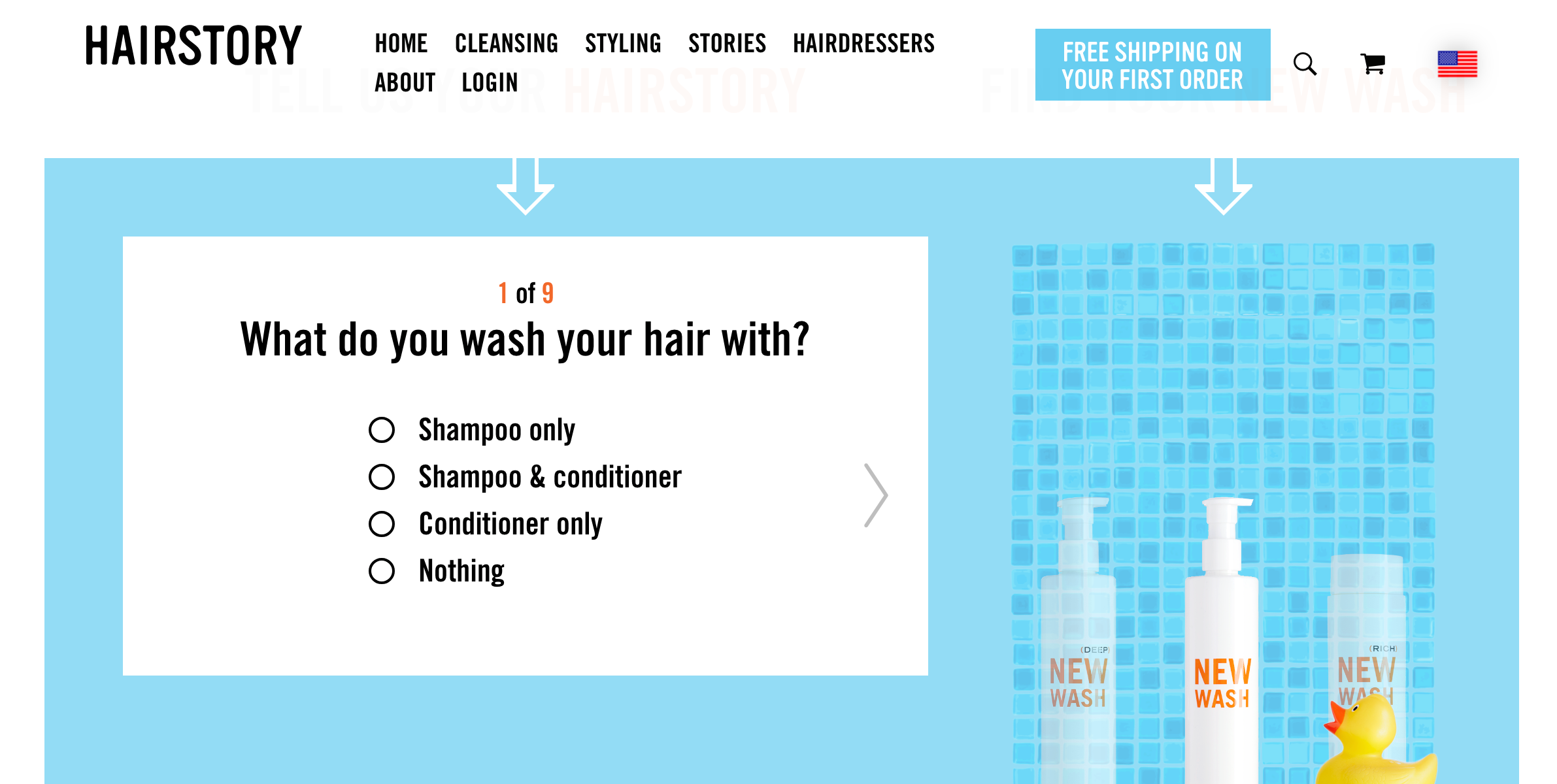
The hair product company Hairstory differentiates themselves with a unique quiz on their homepage. Immediately showing visitors the value of their brand, the quiz allows Hairstory to make customized product recommendations. This personalized treatment through design leaves a positive first impression on visitors just as they’ve entered the site.
39. Native Deodorant
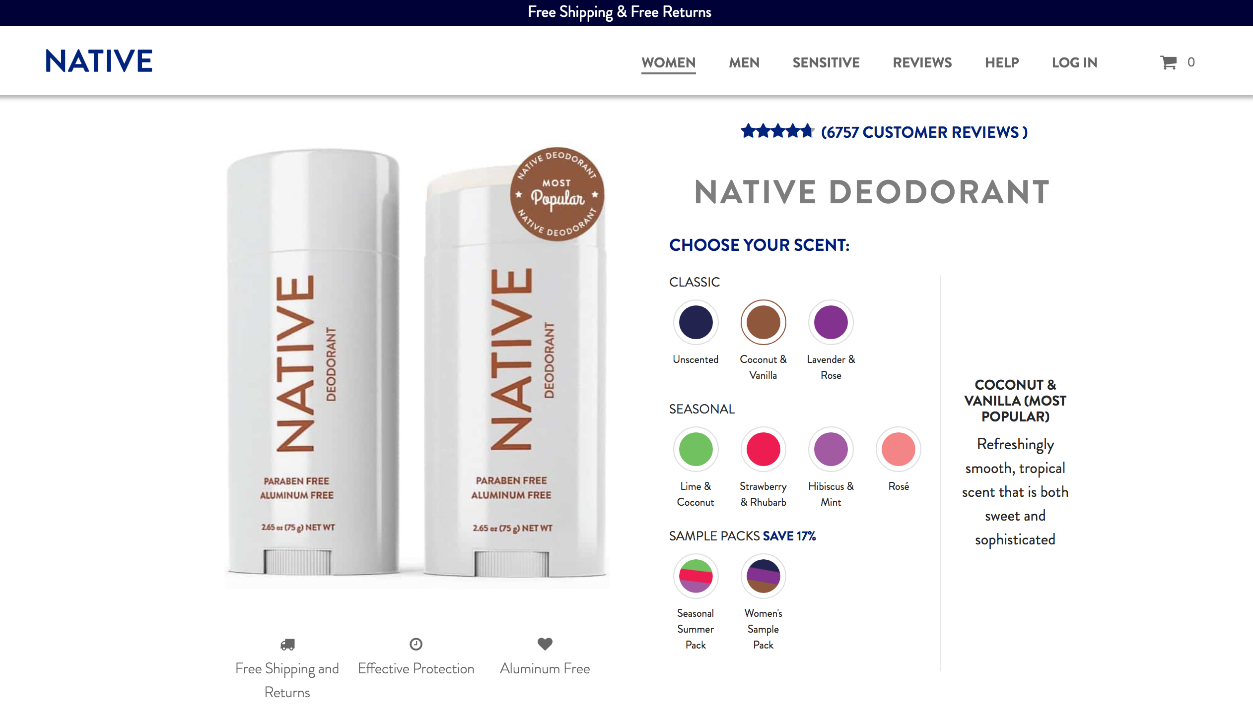
When sites offer too many product pages, the UX becomes disorienting. To create a simple, seamless shopping experience, Native Deodorant consolidated their offerings into three product pages: Women, Men, and Sensitive. On each page, visitors can see the different scents and varieties. Having just three options makes the store incredibly easy to navigate.
40. Harry’s
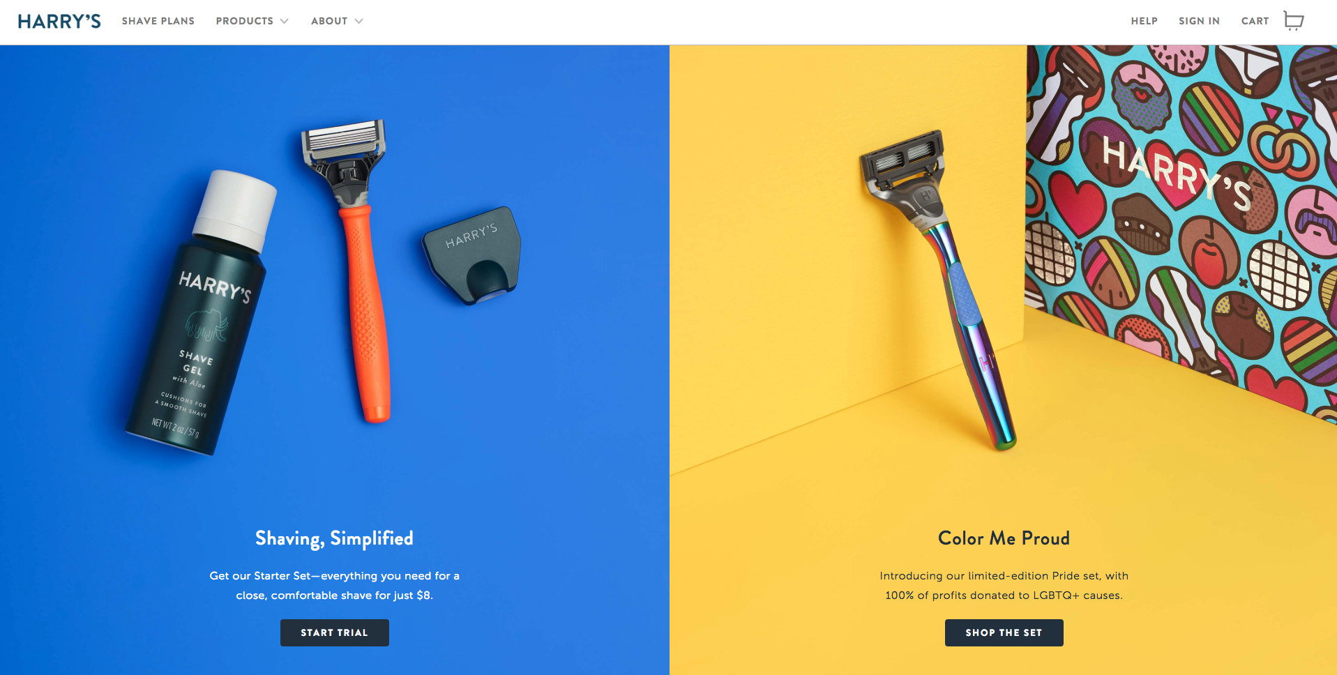
The shaving company Harry’s uses color and high-quality images to show their brand’s value. The bold hues throughout their site—such as the classic orange Harry’s handle—makes the product eye-catching. At the same time, the crisp images showcase the fine details of the razor blades, so visitors can see that Harry’s is high-quality.
41. Quip
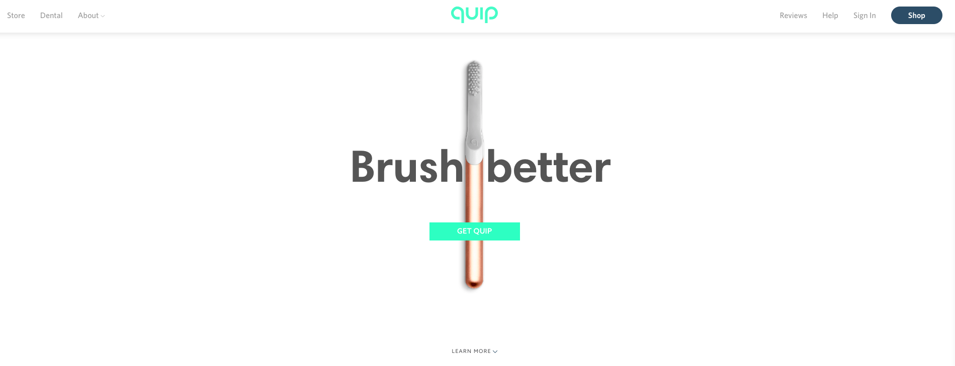
The UX of the toothbrush company Quip is so clear and straightforward in directing visitors to purchasing. Two captivating homepage visuals—a high-res photo of the product and a neon green CTA—form a cross at the center to draw in visitors. Their eyes will naturally move down the vertical toothbrush to hit the CTA, so they know exactly where to shop.
42. Dollar Shave Club
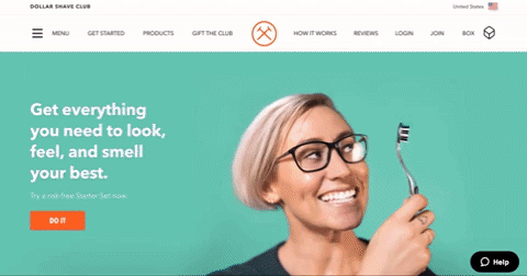
In web design, photos of human faces add a personal feel to your site that builds trust in visitors. Dollar Shave Club takes advantage of this principle with a rotating set of images with people using their products. The motion and bold colors are already engaging, but it’s the concept of showing different users that adds humanity and visitors appreciate.
43. Volition
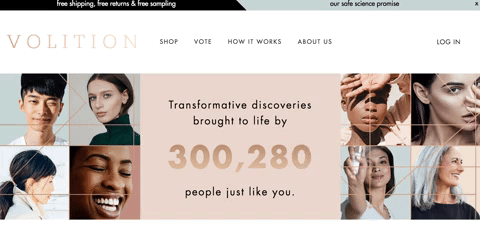
The beauty company Volition has a unique value proposition—their community of users submit ideas for products that are voted on and created, so the process leads to innovative creations. They highlight this value with a captivating animation on their homepage of the number of users in the community increasing. Visitors, intrigued by the motion, are likely to dive deeper into the site to learn about the interesting model.
44. Julep
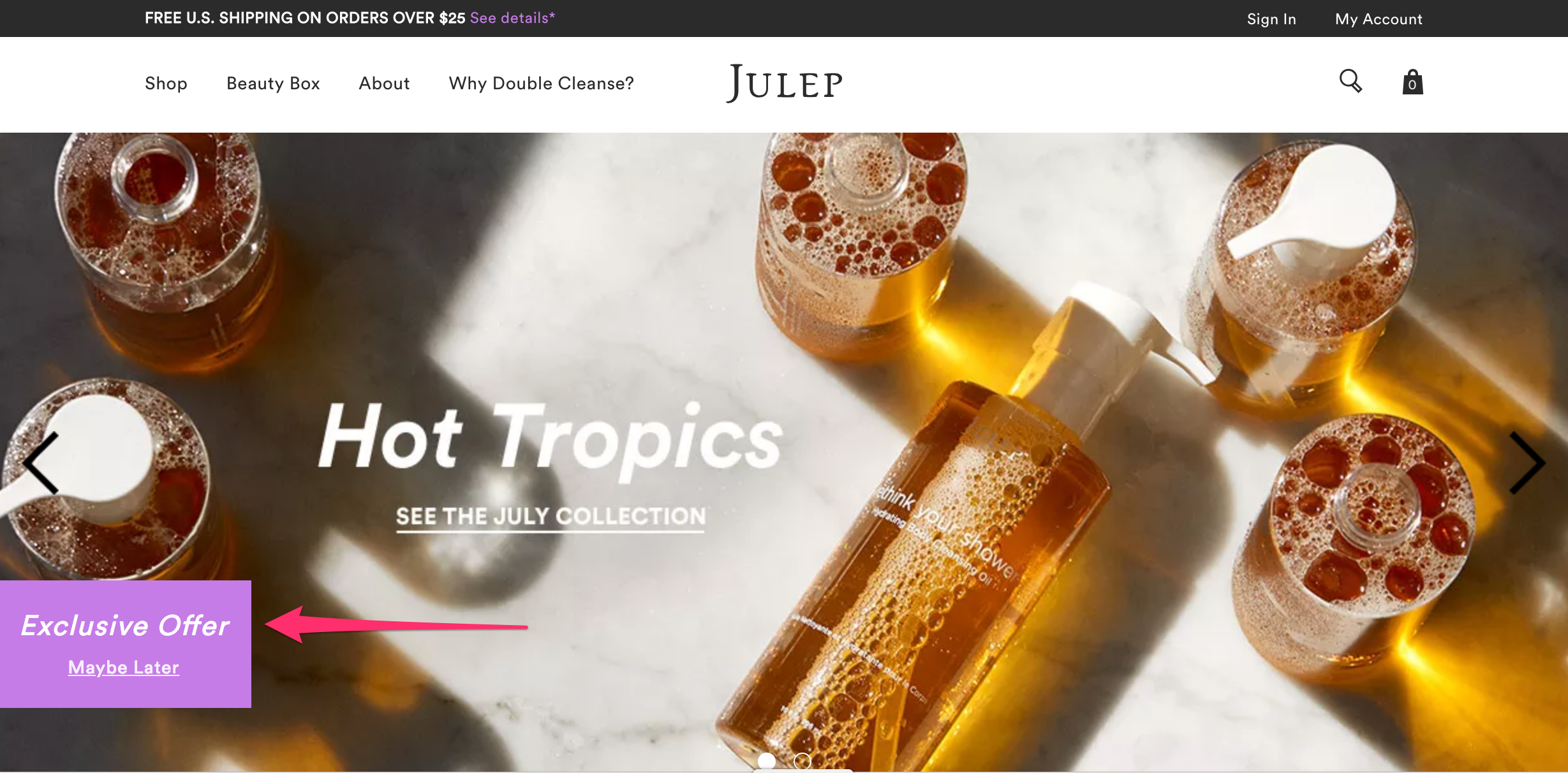
Instead of just using a standard CTA—learn more, shop now—the beauty company Julep features an interesting button to engage visitors. In bright purple, the box offers an exclusive offer to visitors. Visitors who click are offered 25% off if they enter their email address. The effort might seem too intrusive to some visitors, but many will appreciate the reward and begin connecting with the business in exchange for it.
45. Billie
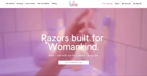
The women’s shaving company Billie grabs new visitors’ attention with a homepage video, one of the most engaging mediums. The video features a feminine pink filter, so women feel welcome to the brand. If visitors are intrigued enough by the video, there’s a stark white CTA for shopping right at the center.
Food & Beverage
46. Winc
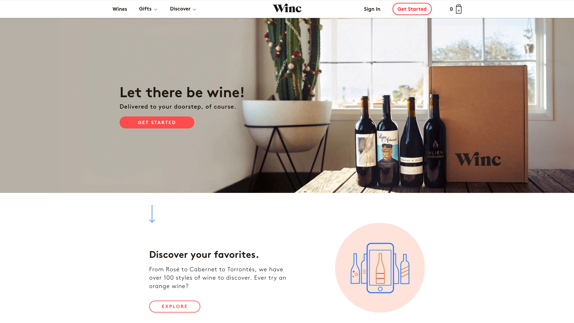
The wine company Winc uses minimal menu categories to simplify site navigation. Choosing only between “wines,” “gifts” and “discover,” site visitors can easily decide where they need to go to complete their desired action, whether it’s buying a wine for themselves or learning more about the company.
47. NatureBox
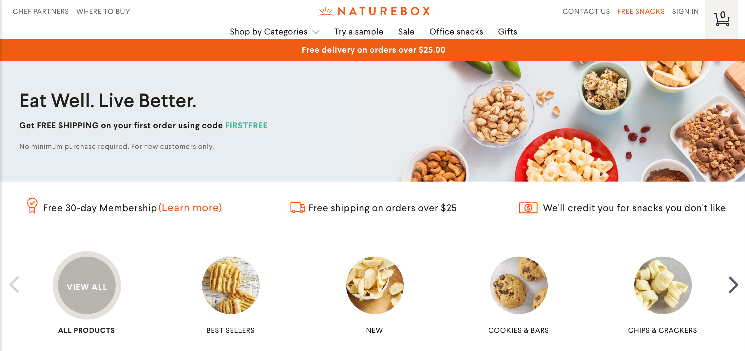
The snack box company NatureBox encourages visitors to explore their site with multiple avenues for reaching categories. Visitors can either click on categories through the top menu, or they can browse through them with an image-based menu on the homepage. Giving visitors both browsing options makes it more likely that they’ll start shopping.
48. Blue Bottle Coffee
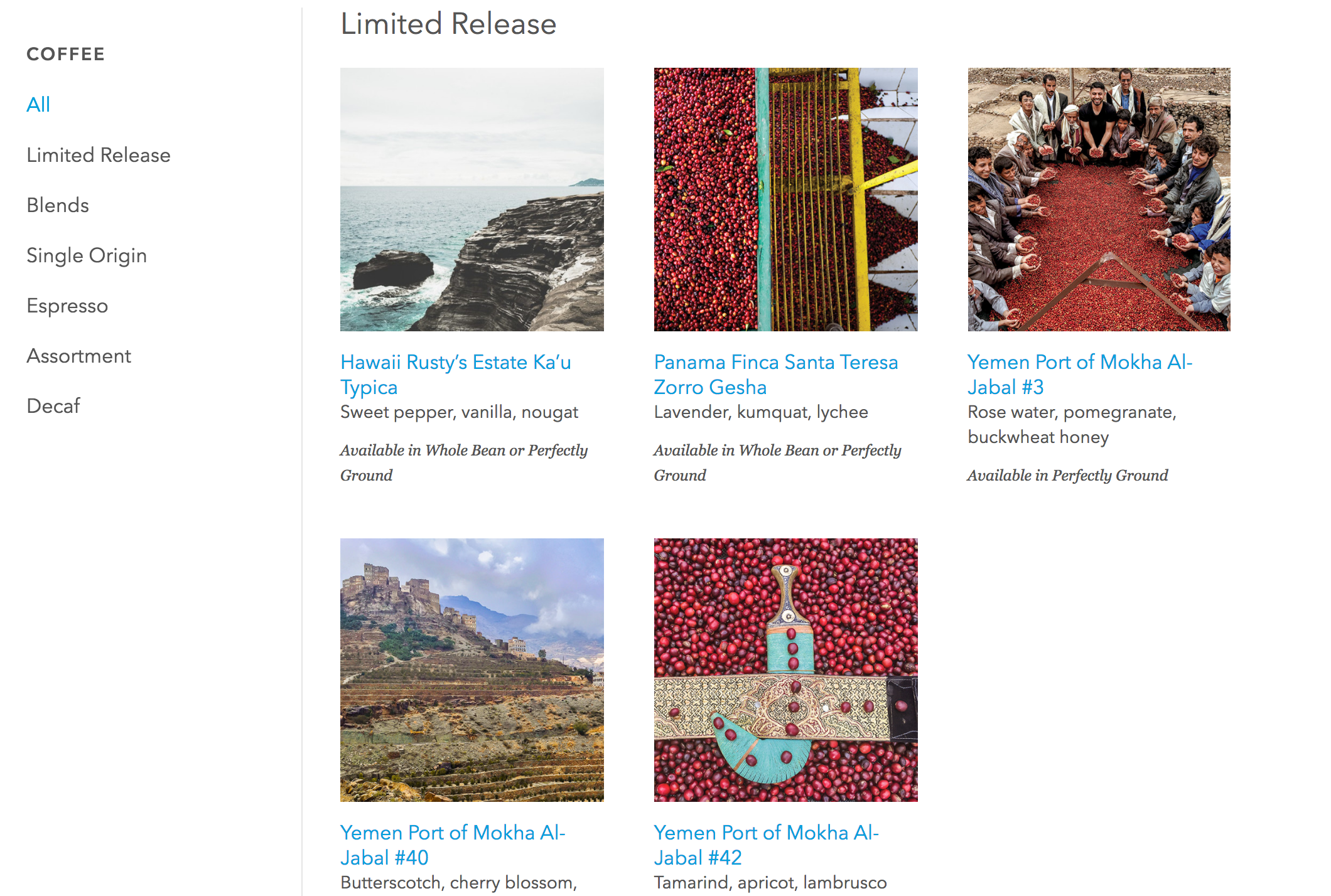
The coffee company Blue Bottle Coffee uses photography to emphasize the exotic, luxurious quality of their products. Rather than just showing images of their coffee beans, Blue Bottle uses gorgeous photos of the locations where their products are sourced to get visitors excited.
49. Crema
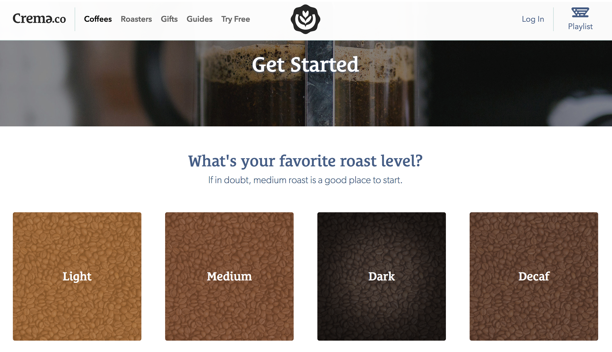
The coffee subscription company Crema makes it simple for visitors to interact with their product through their accessible, visually-focused customer survey. After clicking the “Get Started” CTA on the homepage, visitors are directed to a 3-question survey with pictures for each answer. Easy to reach and easy to answer, this survey is great for encouraging visitor engagement.
50. Soylent
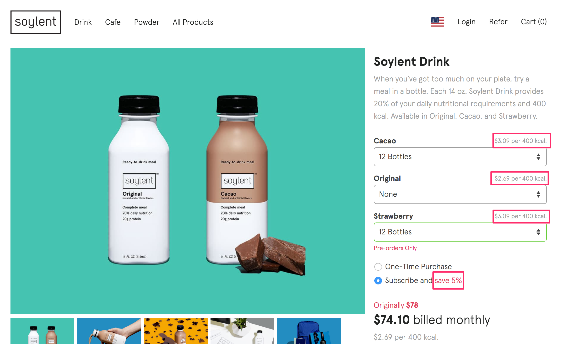
The meal replacement shake company Soylent uses text on product pages to break down their unique value to visitors. Rather than just listing the quantity and price, Soylent includes the value per 400 calories as well as the savings from subscribing.
Let Design Draw in Your Customers
The web design of your e-commerce store shapes your customers’ entire shopping experience. Just as it can encourage purchases, your design can lead visitors to abandon their carts. To drive orders, your design should take into account UX principles and your brand’s style. Considering both will push visitors to understand your brand’s value and move to checkout with minimal friction.
While you want your web design to be unique to your business, it never hurts to consider strong designs from other e-commerce stores to learn how to improve your own. Review the examples in this guide to understand how design can drive purchases and what strategies you can implement on your own site.